Zosh

Real good energy shot
• Design Strategy • Brand Identity Design • Packaging Design • Visual World • Brand Communication • Website Design
Zosh is India’s first pure energy shot —no fizz, no sugar—designed to keep up with the demanding rhythms of life in India. . Between deadlines and dates, pursuing passions and chasing dreams, online and offline, young India is living a very active life. Zosh was born out of the belief that there should be a better way to energize. Without it, one tends to pick up unhealthy habits to keep going. As a category creator, the real challenge was to build the brand as a distinct and viable alternative for instant energy. We partnered with Zosh to craft a unique brand narrative, identity, packaging, and website design.
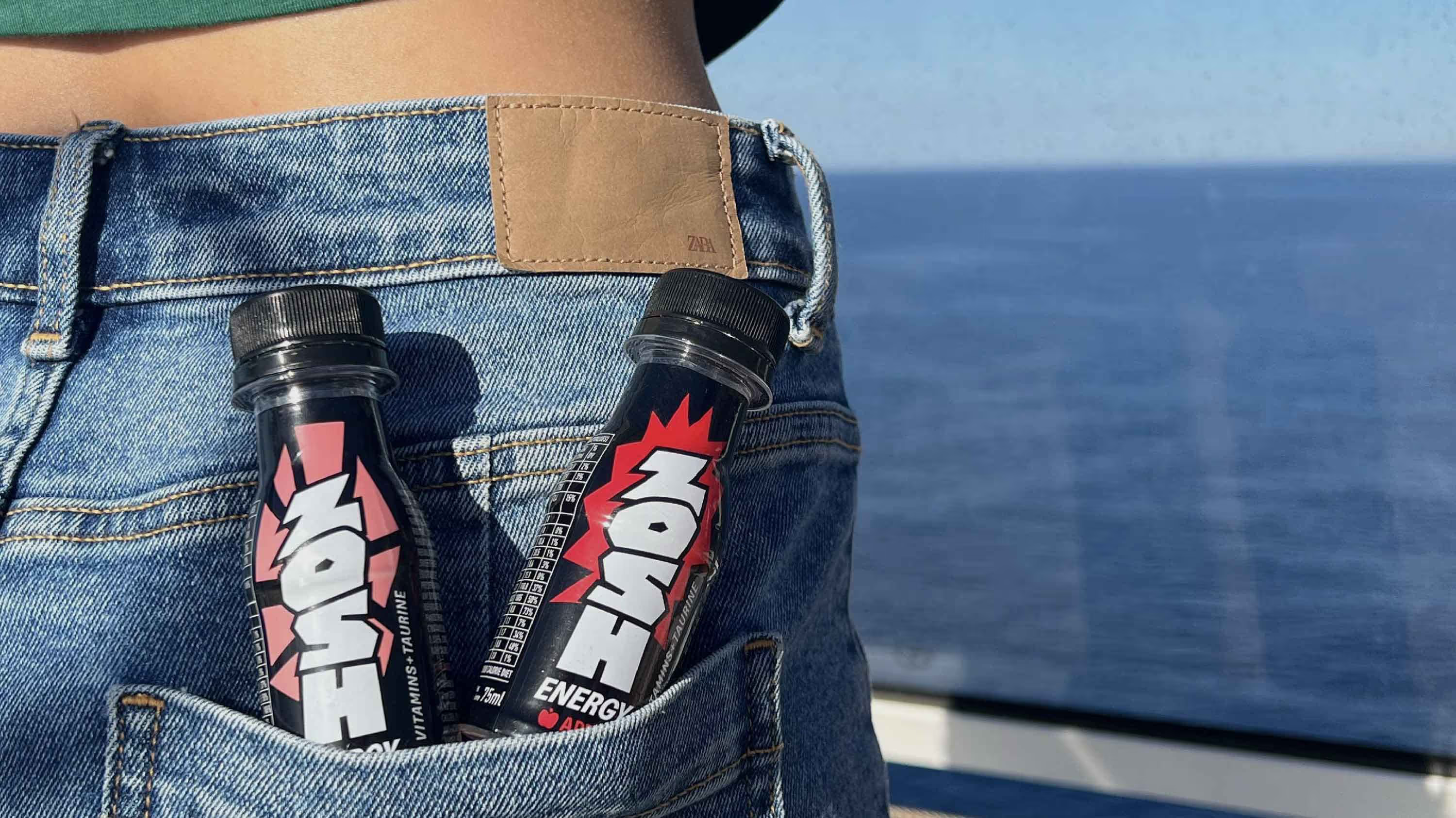
Branding that does not sleep, but stands out.
It’s not just the brand we had to build; we had to build the category too. That’s why it is imperative for the brand to look as fresh as their product. From this foundation, we created an identity that depicts energy in a bold, compact format. With packaging being the brand’s biggest as well as smallest real estate, the vertical logo unit offers both uniqueness and maximum visibility. The result? A vertical logotype. It’s unique. It’s clear. It stands. And it shows strength. Black was chosen as the color of pure energy, enhancing the brand’s bold claims and making it instantly recognizable in its category. A vibrant palette of secondary colors brought the design system to life, while a series of icons and illustrations helped shape the brand's communication.
Infusing energy into typography
Typography represents a brand's visual voice. It accounts for 85% of brand visibility, influencing communication and perception. So, we created a custom multi-script typeface family - Zosh Energy Blast. It not only gave the brand a distinct yet recognizable image; it also served as the foundation for establishing an immediate connection between the brand and its actual consumers. Inspired by the dynamic pulse of life in India, Zoshenergy.ttf reflects both—the spark it takes and the strength to make anything happen. This bold and dynamic typography is characterised by distinct visual structures, built by breaking the guide.  The purpose of creating Zosh Energy Blast goes beyond mere aesthetics. It is designed to celebrate and honor the dynamic lives of the 1.4 billion individuals Zosh Energy aims to awaken and empower.
A sip of Zosh Energy
To make the audience feel more awake and aware, brand communication became the place to deliver on the promise of instant energy. We shifted the lens from information to experience. Even the website was designed to feel alive—with the bottle as the cursor, energizing everything it touched. The entire experience was built to feel charged, giving users a real sense of what Zosh stands for. To break visual monotony, we created a series of illustrations inspired by vintage matchbox labels—extending them into merchandise and brand assets.
Designing how young India stays energised. The real way.
play
pause