Amazon MX Player
India's destination for free entertainment
• Design Strategy • Brand Refresh • Brand Identity • Brand Experience
There are countless OTT channels in India. However, entertainment has never been easy or accessible for Indians. Amazon and MX Player partnered to build India’s largest streaming platform, promising free entertainment to over 250+ million users. A place where every genre, creator, language and mood exists side by side. All available at no cost.
But abundance has a downside. The more content you offer, the harder it becomes to create a brand that feels coherent Following Amazon's acquisition of MX Player, there was an opportunity to bring two well-known brands together. Not by forcing them into one another, but by creating a system that could help them work as one. The challenge wasn't simply combining two logos. It was building a visual identity capable of holding an endless stream of stories.
But abundance has a downside. The more content you offer, the harder it becomes to create a brand that feels coherent Following Amazon's acquisition of MX Player, there was an opportunity to bring two well-known brands together. Not by forcing them into one another, but by creating a system that could help them work as one. The challenge wasn't simply combining two logos. It was building a visual identity capable of holding an endless stream of stories.
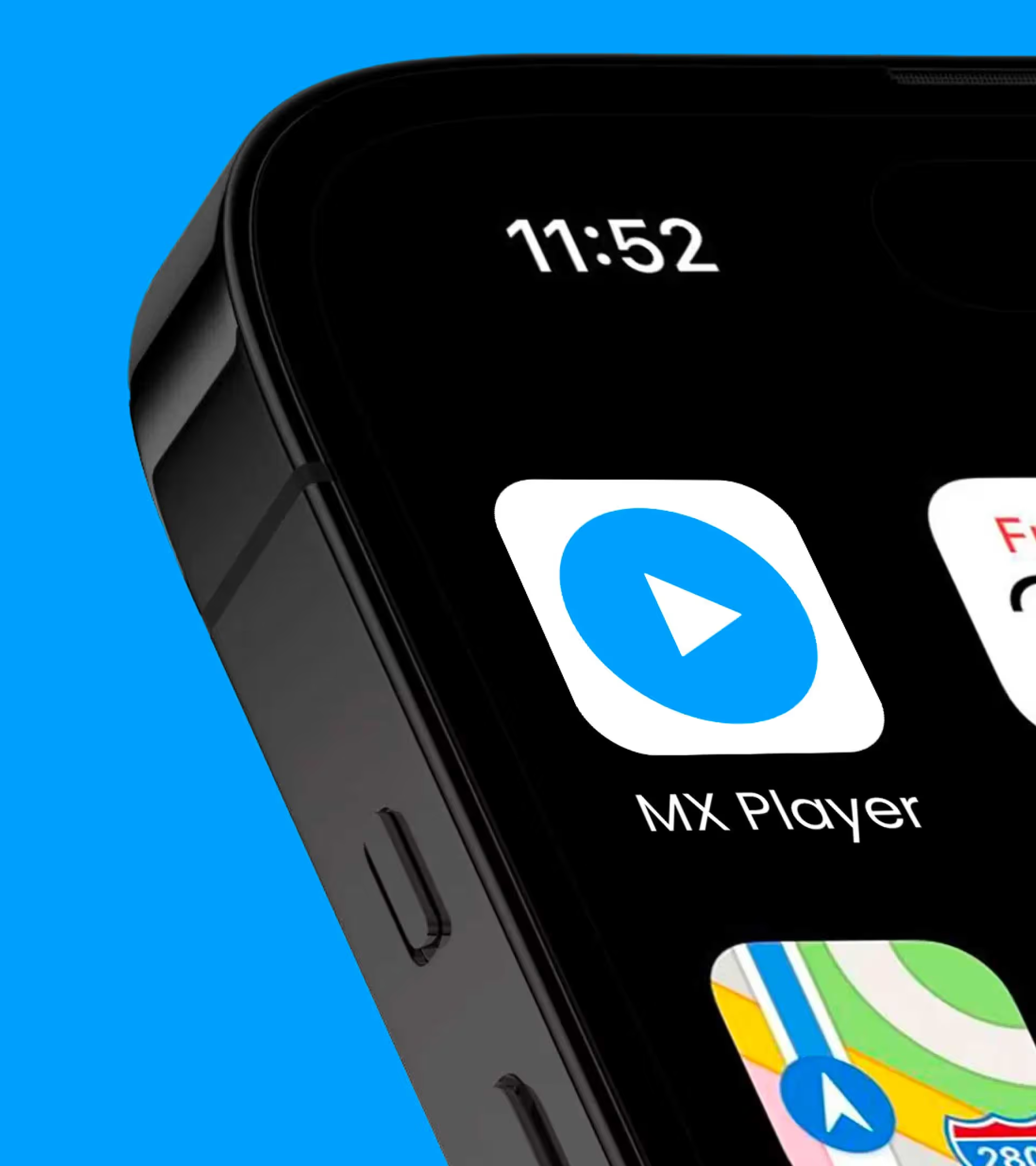
Under the horizon of entertainment.
The letterforms were redrawn to remove inconsistencies and improve balance across the identity. Amazon Amber anchored the brand in familiarity and trust, while MX Blue was refreshed to establish a distinct presence within the Amazon ecosystem. But the real opportunity wasn't in the logo. It was in what the platform represented. An ever-expanding world of shows, films, creators and cultures.
This thinking led to the creation of the AMXP Horizon. A symbol inspired by limitless possibility. Part navigation tool, part storytelling device, the Horizon became the organising principle for the entire brand, creating distinction in communication while bringing consistency to a platform of extraordinary scale.
This thinking led to the creation of the AMXP Horizon. A symbol inspired by limitless possibility. Part navigation tool, part storytelling device, the Horizon became the organising principle for the entire brand, creating distinction in communication while bringing consistency to a platform of extraordinary scale.

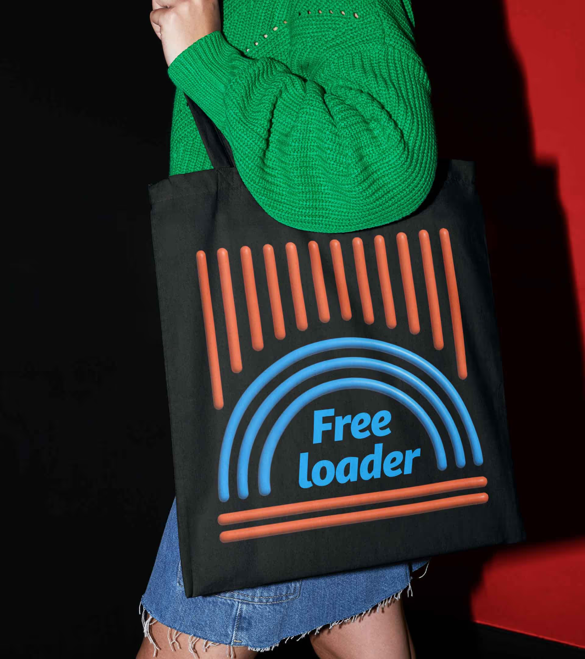
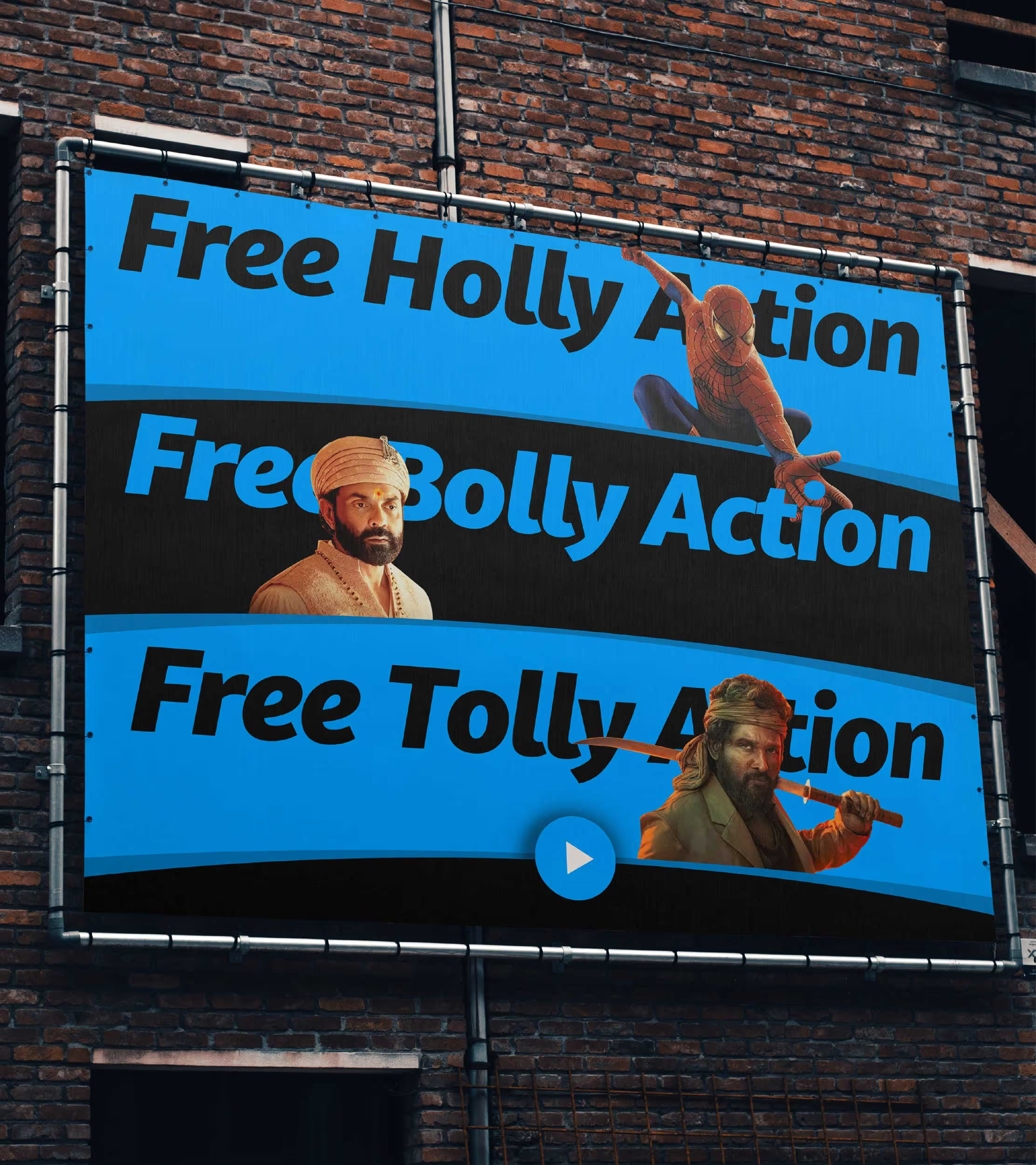
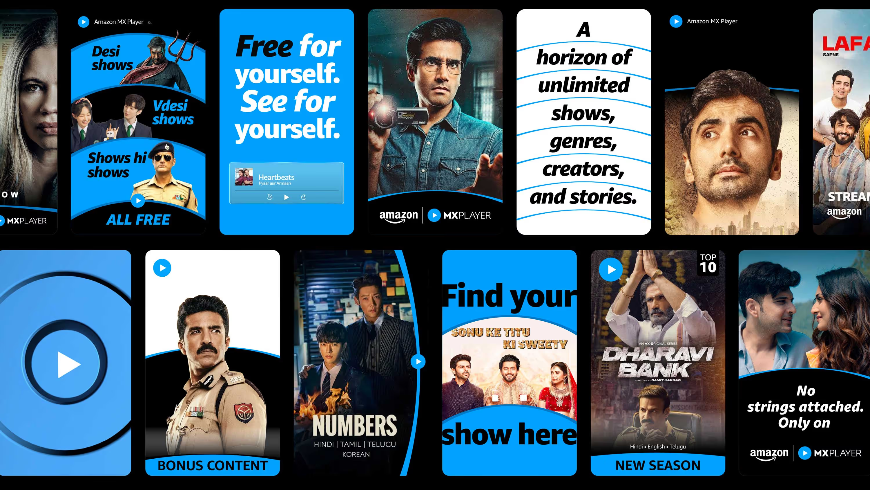
The system build for FREE.
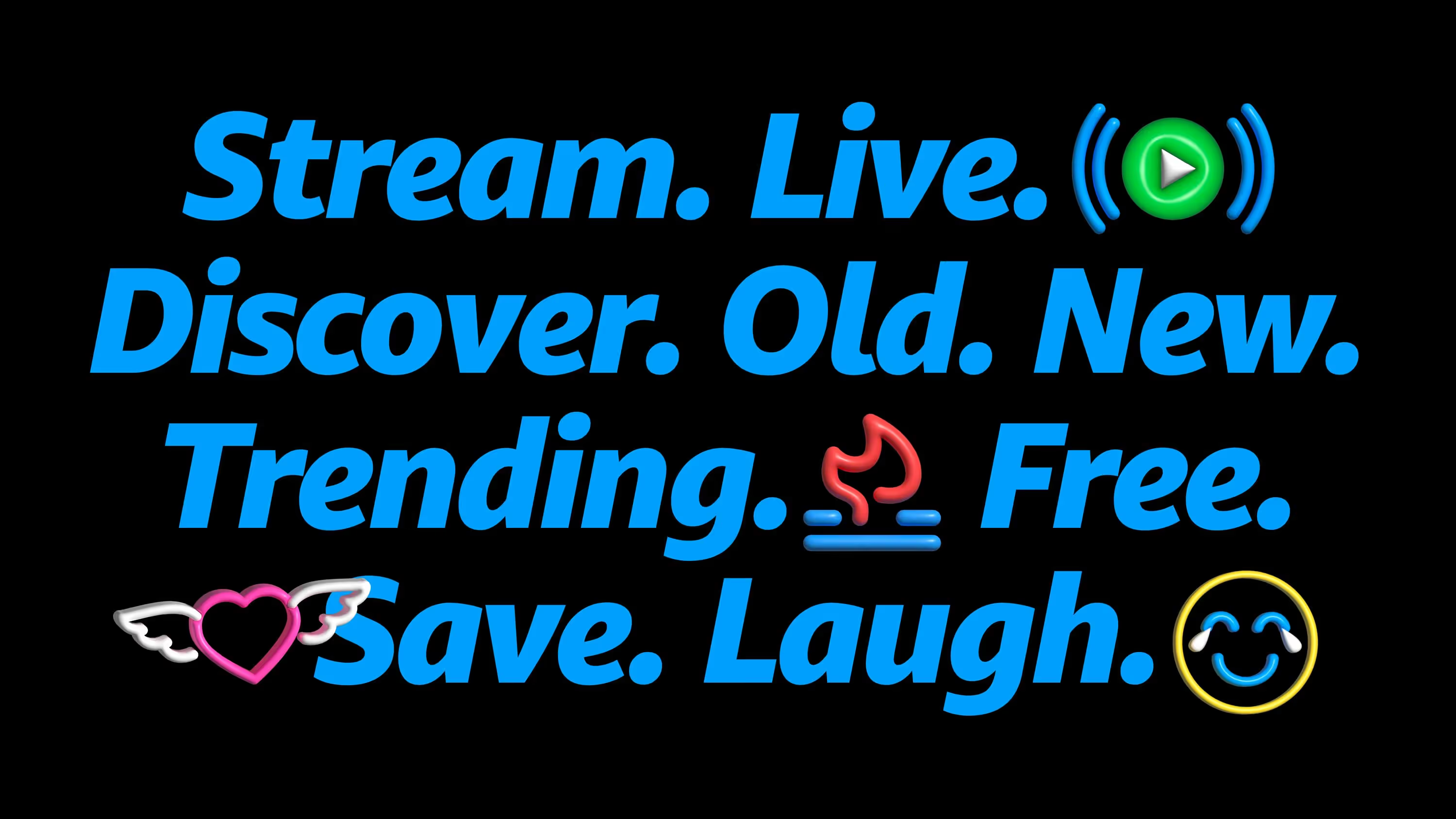
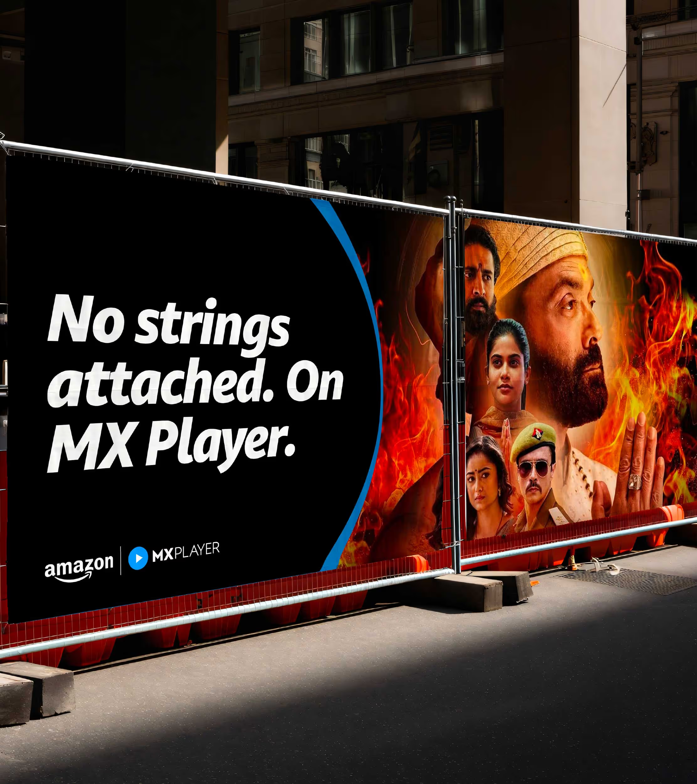
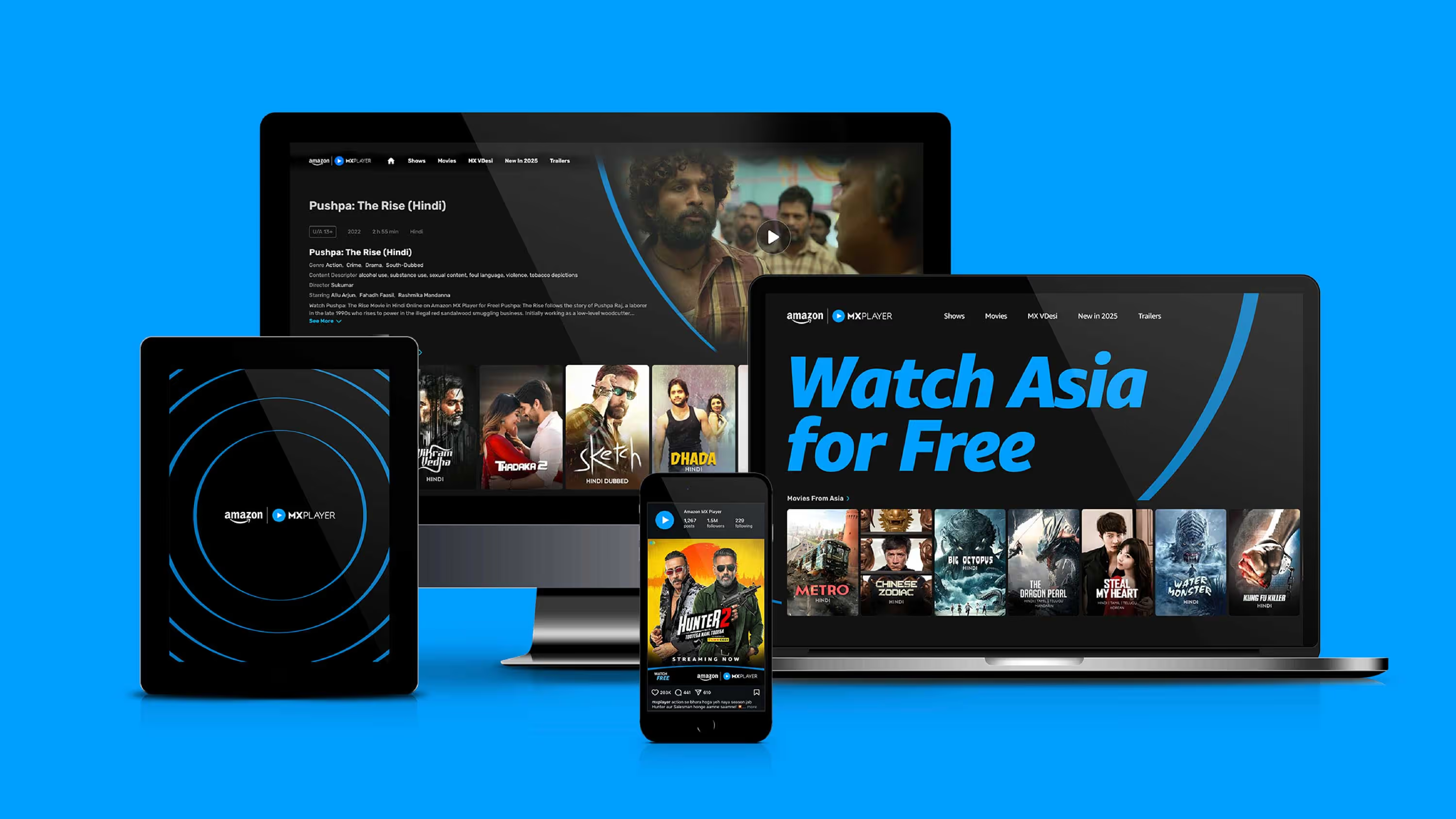
From show artwork and social content to product experiences and campaigns, the Horizon helped every touchpoint feel connected. The result is a brand built around a simple belief: Stream Freely. Explore Endlessly. A place where viewers weren't limited by subscriptions, genres or algorithms.
A platform free to stream.
Free to discover.
Free to explore.
Because when entertainment is free, one can easily expand their horizon of entertainment.
A platform free to stream.
Free to discover.
Free to explore.
Because when entertainment is free, one can easily expand their horizon of entertainment.


go back
India’s destination for free entertainment.
play
pause