Bolas
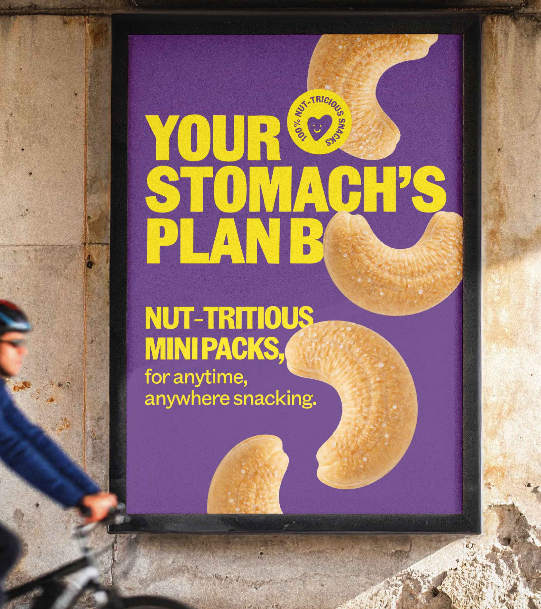
Your stomach’s Plan B
Product Strategy • Campaign Identity • Packaging • Marketing Collaterals
Dry fruits have always had a good reputation. Just not much of a daily role. They’re bought in bulk, gifted during Diwali, stored in jars and remembered by only elders.
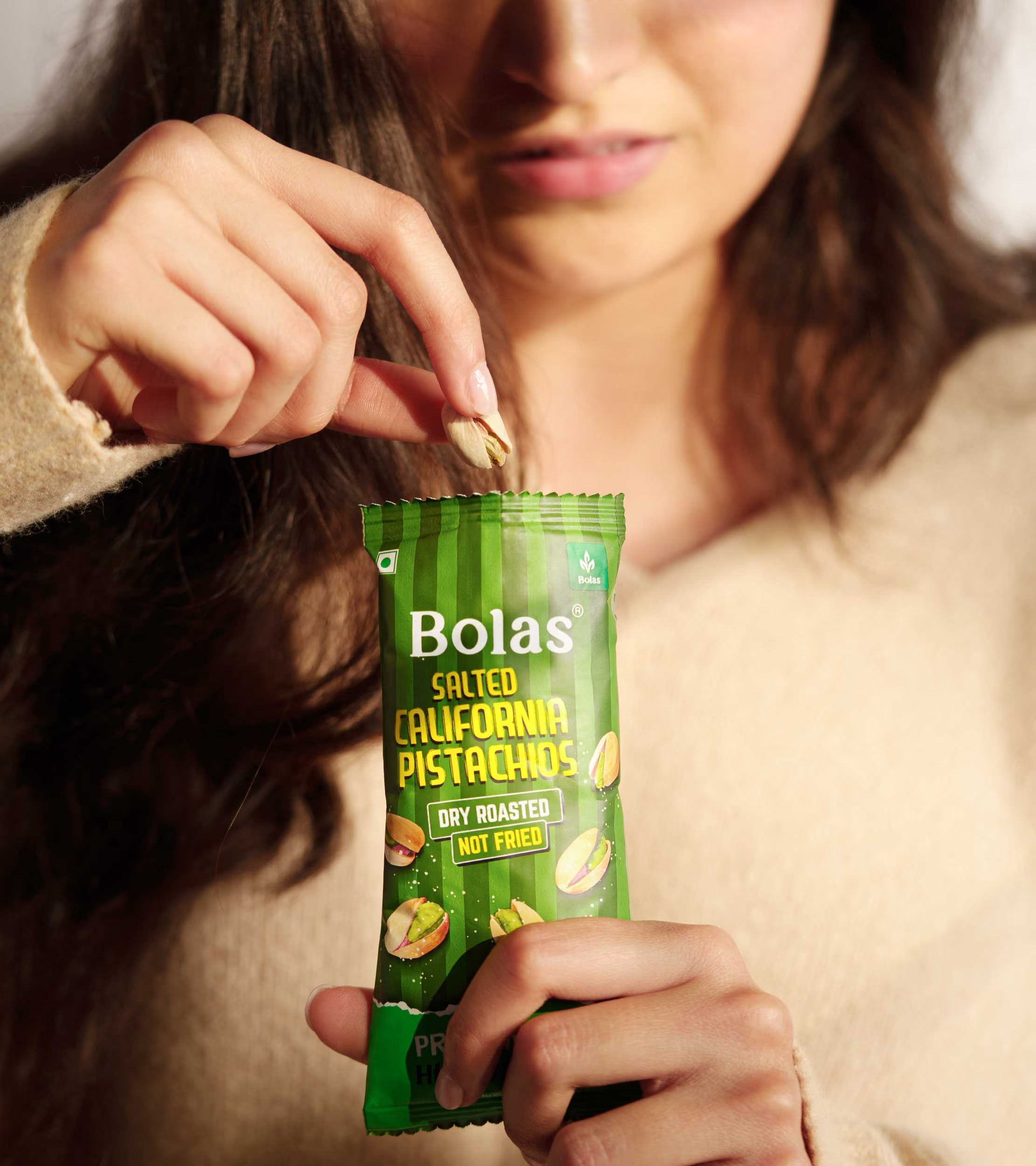
Bolas came to us with a new idea: nut-tricious micro-snacking. They were making dry fruits available in small, affordable packs that could fit into everyday life. We worked with them to define the role of this new format, create its campaign identity and bring it to life across communication.
Bolas came to us with a new idea: nut-tricious micro-snacking. They were making dry fruits available in small, affordable packs that could fit into everyday life. We worked with them to define the role of this new format, create its campaign identity and bring it to life across communication.
Making dry fruits a part of the plan.
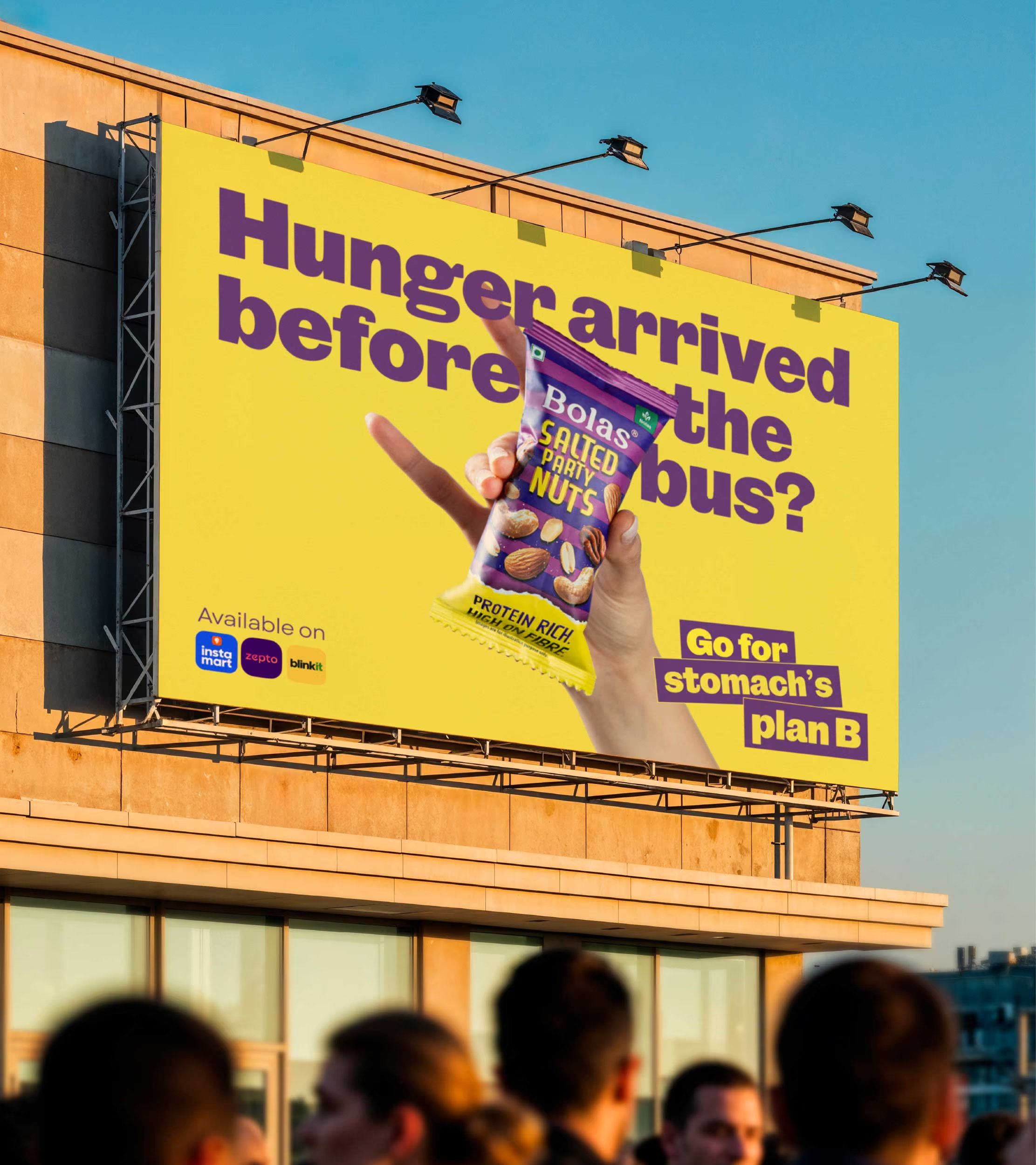
Life rarely goes according to plan. Meetings run late. Flights get delayed. Traffic gets worse. Lunch gets pushed. No matter how much you plan, plans can always change. So we positioned Bolas as the dependable backup for those little moments when Plan A falls apart.
Your stomach’s Plan B.A simple idea that could travel across situations, products and media, from a bus stop to a wine shop, from a delayed lunch to a long commute.
Your stomach’s Plan B.A simple idea that could travel across situations, products and media, from a bus stop to a wine shop, from a delayed lunch to a long commute.
A snacking lens for health
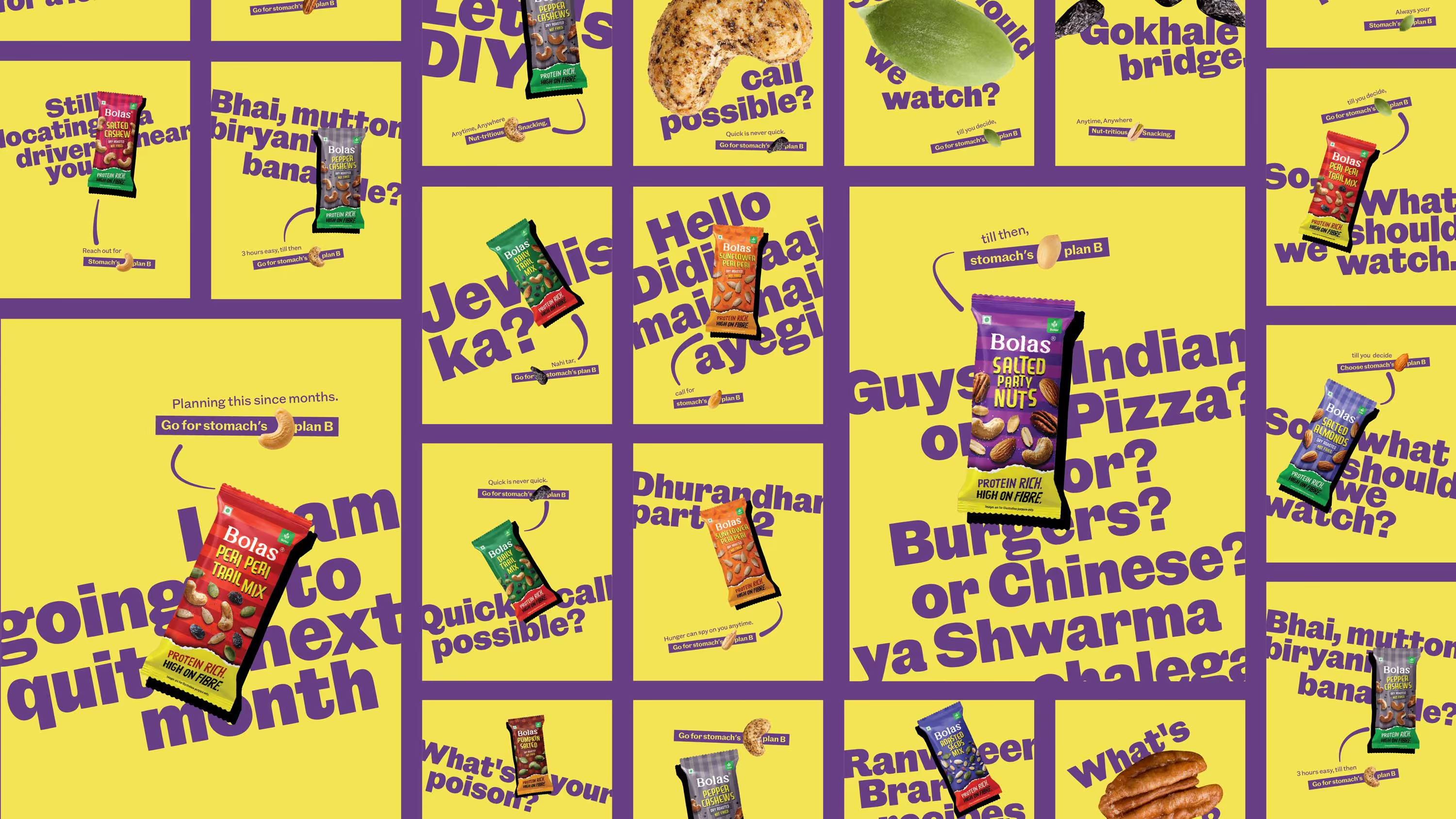
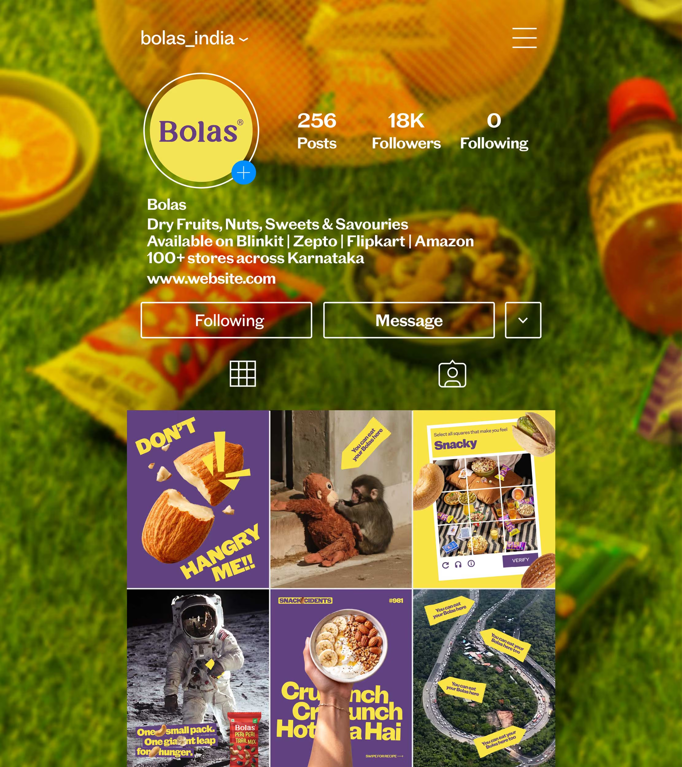
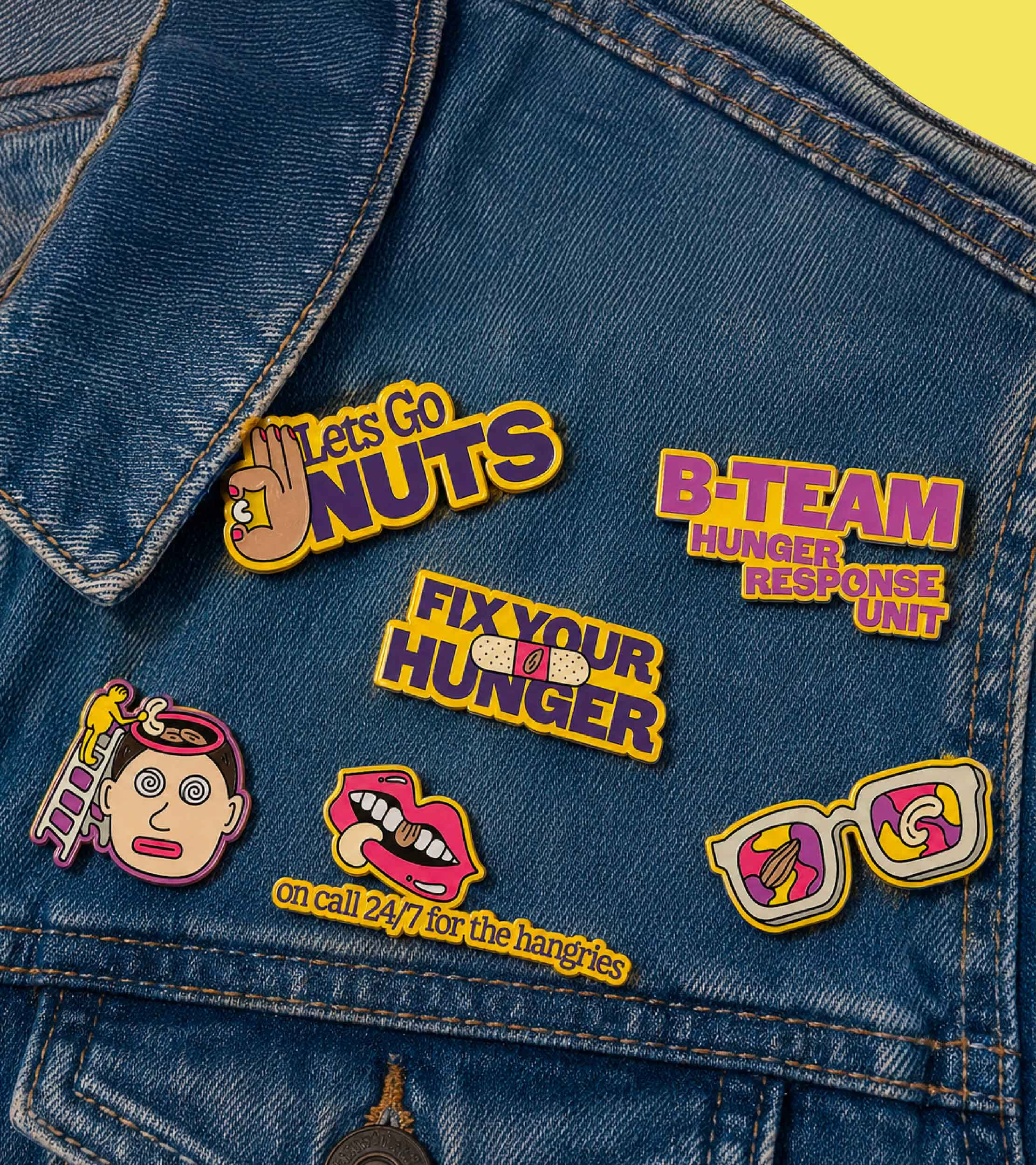
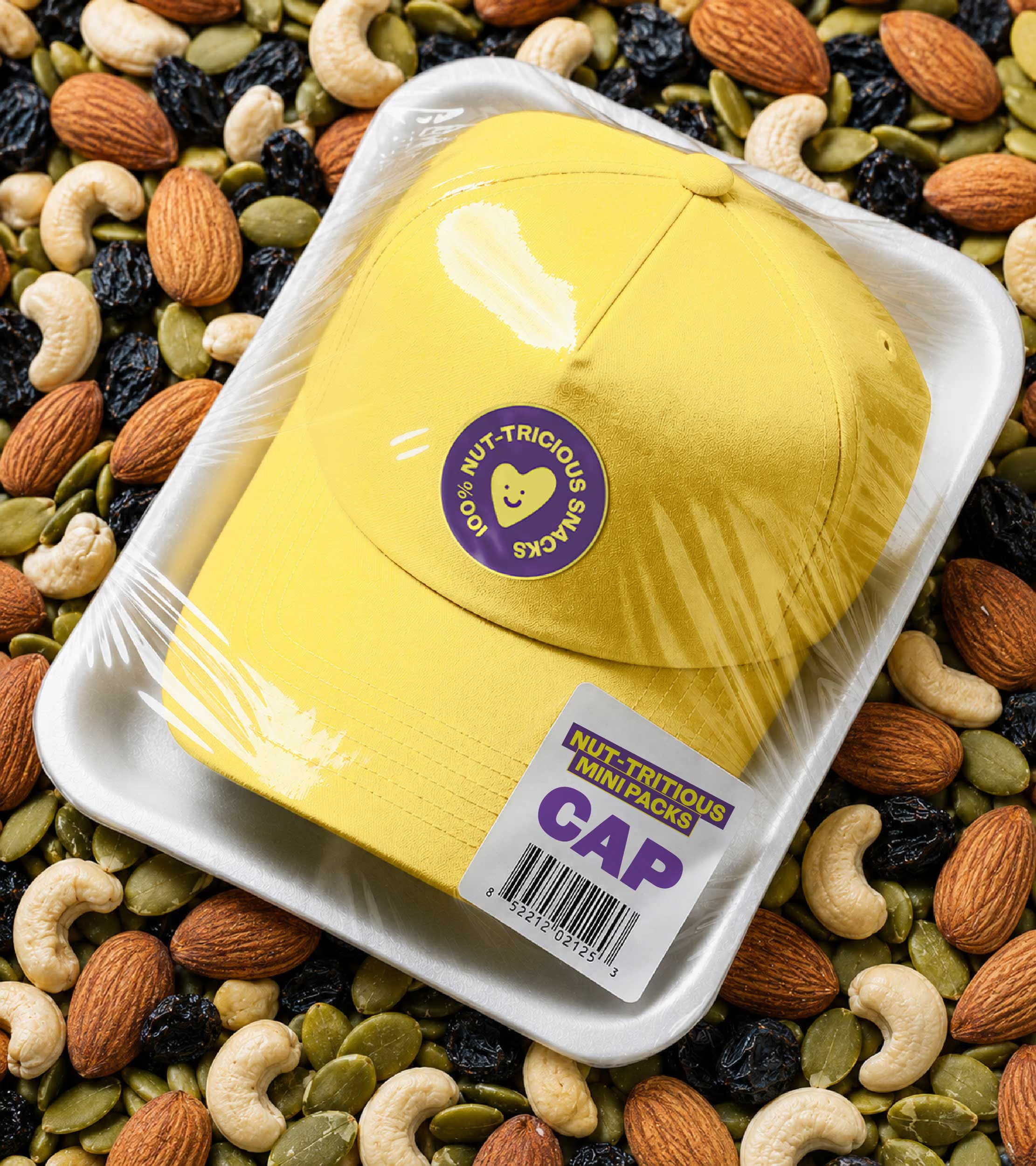
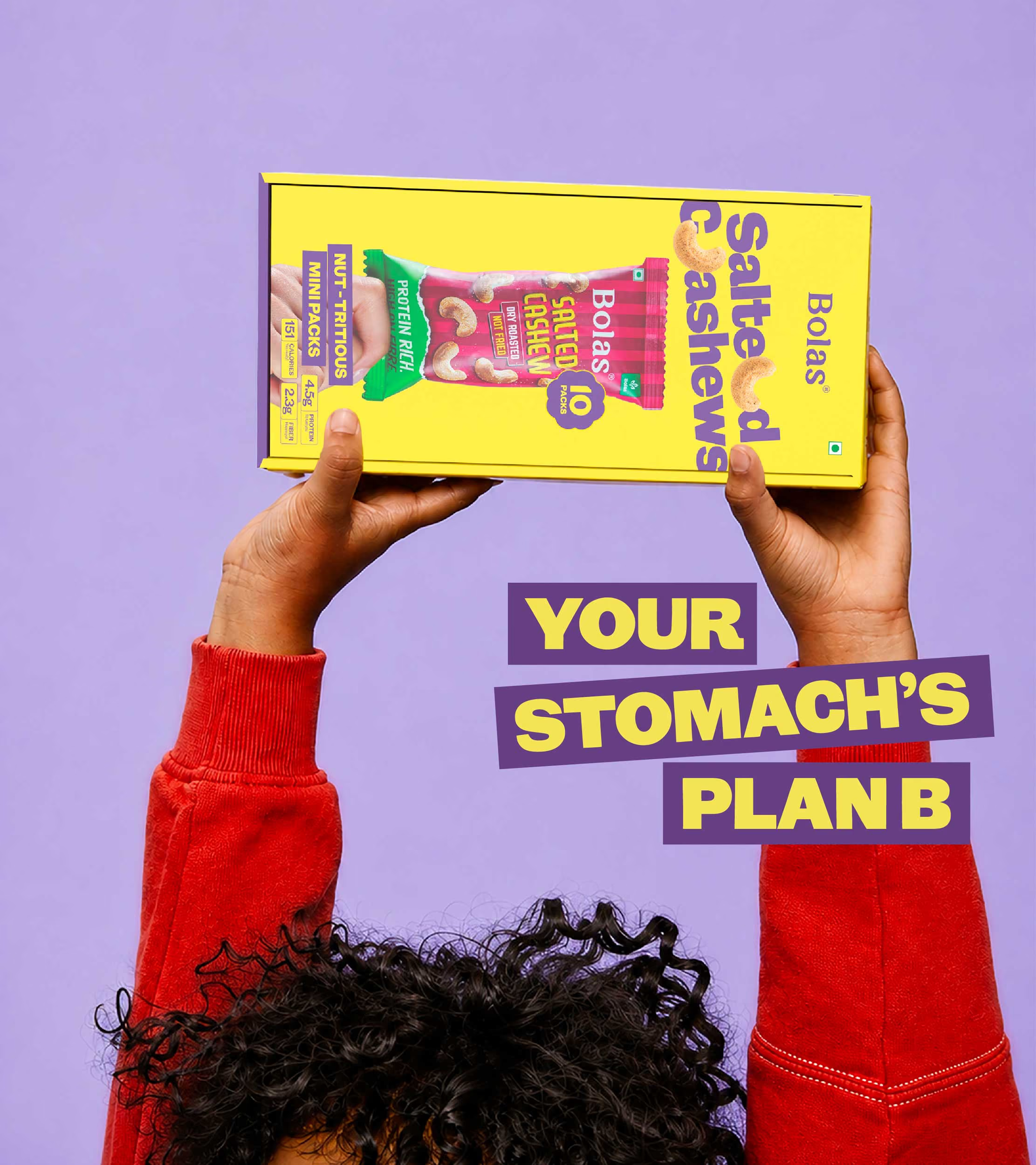
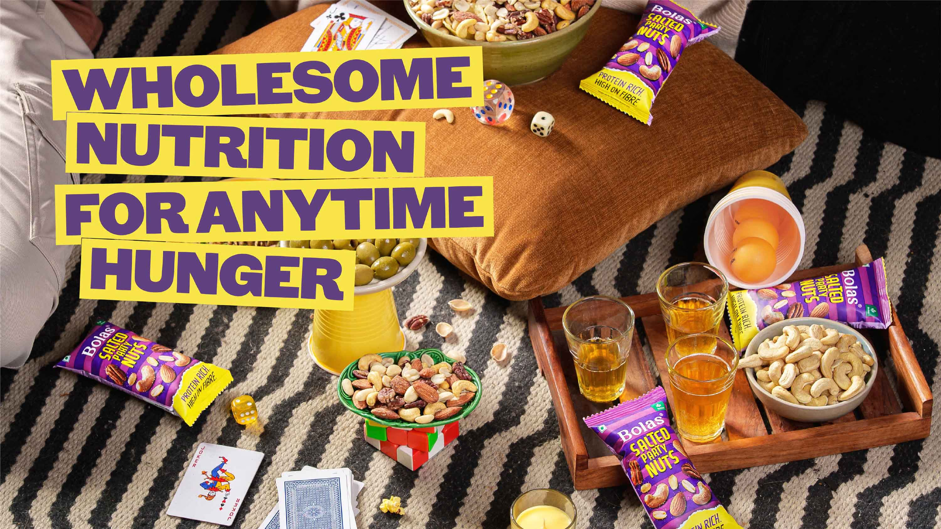
The campaign identity needed to feel as flexible as the product itself. Plus, we wanted to re-look at the visual language from a snacking lens, rather than a healthy one. So, Bolas’ new purple and yellow brand colours, bold typography and dry fruits became the brand’s playground. Words could move, break apart and make space for the product, allowing the identity to adapt to different situations without losing its character.
The result was a system that could be loud on a billboard, quick on a shelf and just as relevant in a digital format.
The result was a system that could be loud on a billboard, quick on a shelf and just as relevant in a digital format.
An idea made to move
The next job was to make people relate to Bolas as a snacking solution. So, we took the campaign into the real world through contextual communication, talking to people about the moments they actually find themselves in.Stuck in traffic.
Still deciding what to order.
Finding a driver may take longer than usual.Each situation gave Bolas a reason to show up, making the idea of micro-snacking feel less like a new product format and more like something that naturally belongs in everyday life. From hoardings and bus stops to retail, kiosks and quick-commerce listings, Your Stomach’s Plan B gave Bolas a simple way to make dry fruits feel less occasional and a lot more everyday.
Still deciding what to order.
Finding a driver may take longer than usual.Each situation gave Bolas a reason to show up, making the idea of micro-snacking feel less like a new product format and more like something that naturally belongs in everyday life. From hoardings and bus stops to retail, kiosks and quick-commerce listings, Your Stomach’s Plan B gave Bolas a simple way to make dry fruits feel less occasional and a lot more everyday.


go back
Expanding consumption occasions for an occasional product
play
pause