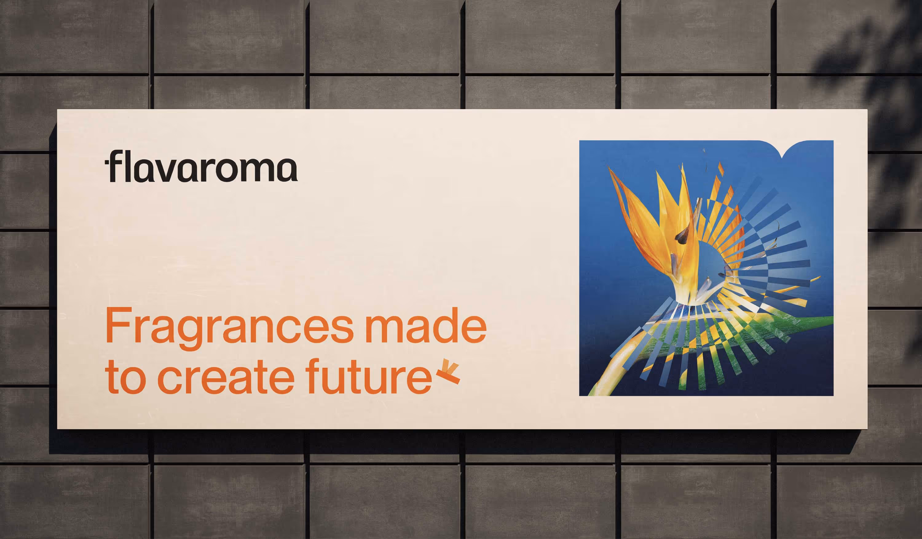
Flavaroma
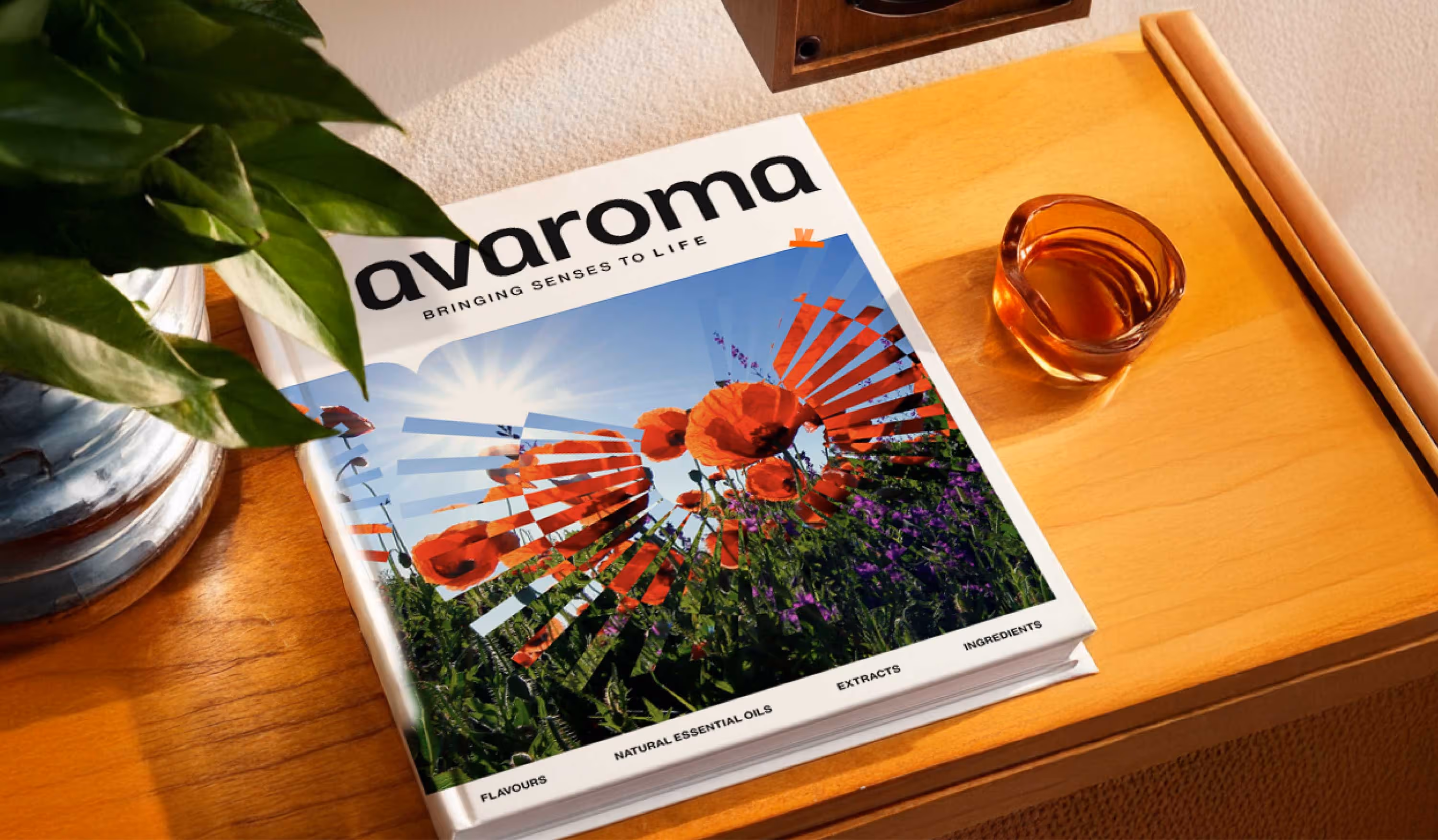
Bringing senses to life
• Design Strategy • Brand Refresh • Brand Identity• UI/UX
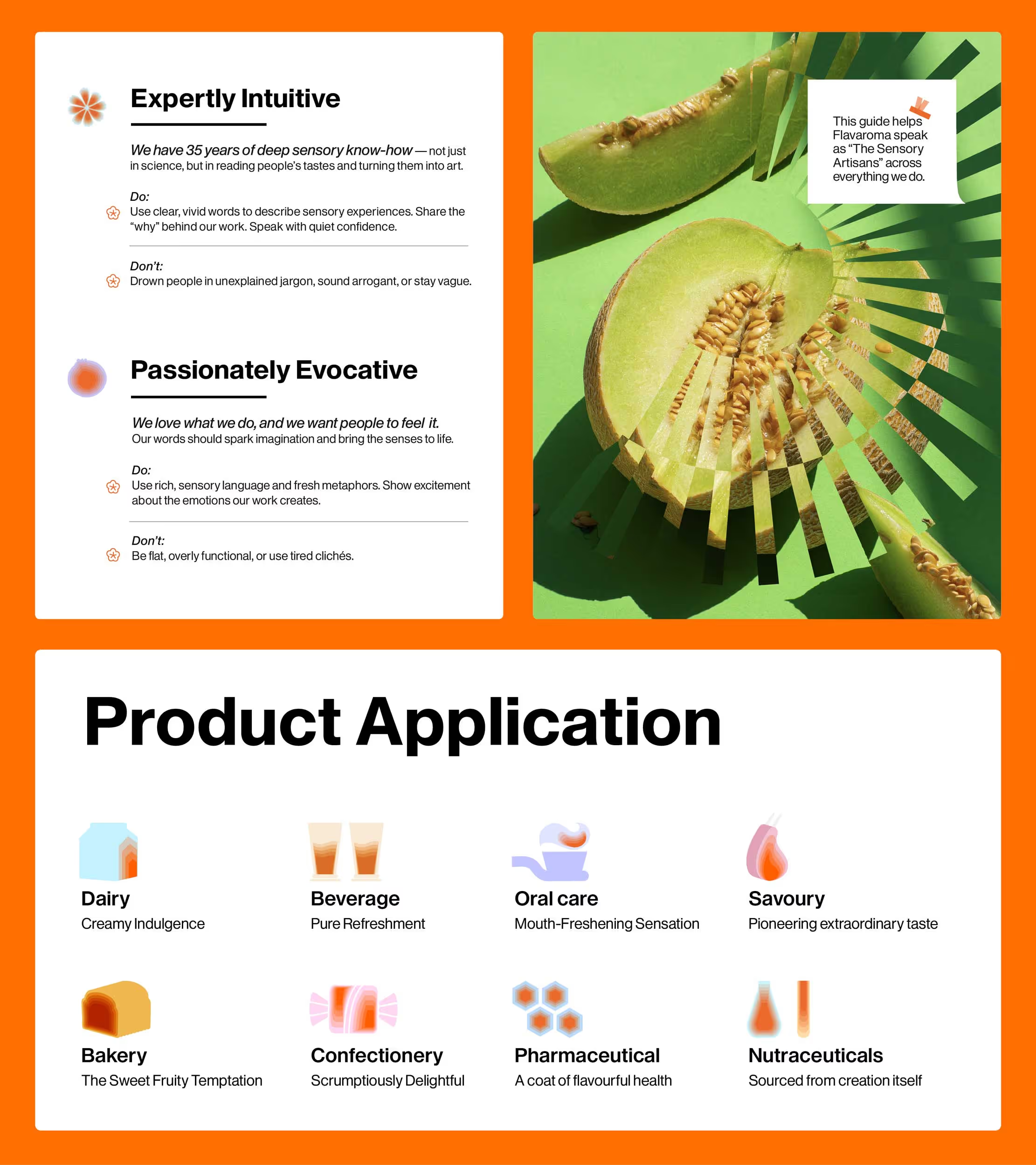
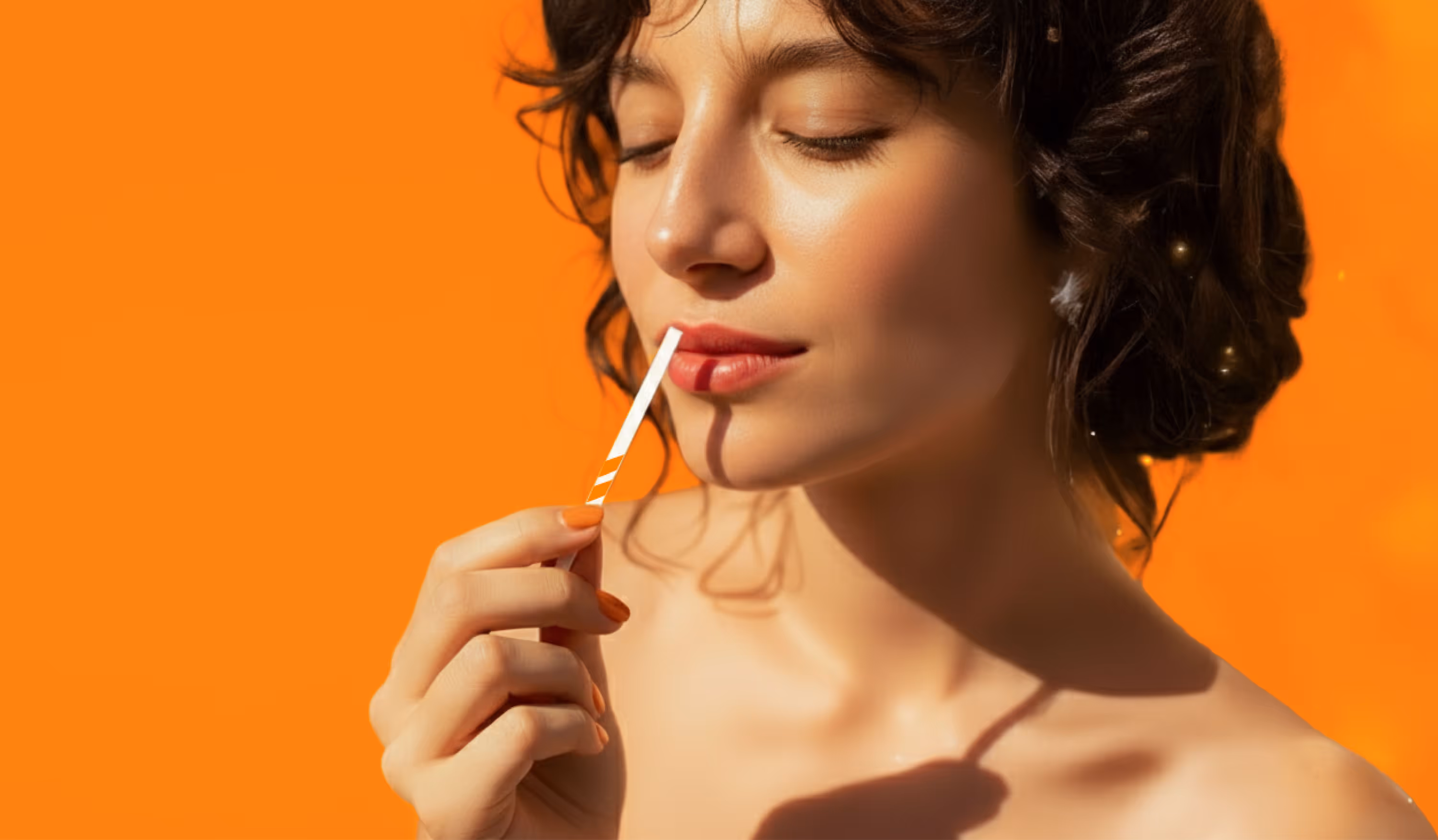
Not just flavours. Not just fragrances. Flavaroma designs experiences. Each one is a carefully crafted journey, felt in taste, carried in aroma, and remembered in emotion. For over 35 years, Flavaroma has transformed everyday products into extraordinary sensory moments. So when we began reimagining Flavaroma’s identity, the goal wasn’t merely to reflect a legacy. It was to create a visual world that feels as layered and sensory-rich as the brand itself.


Bee for branding
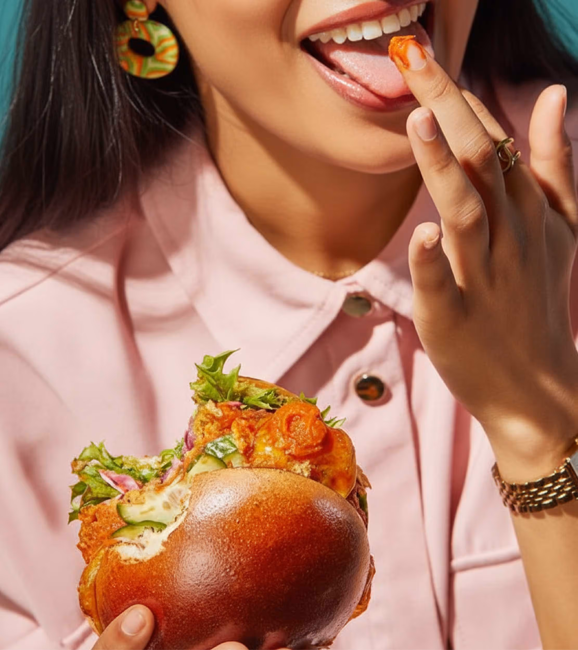
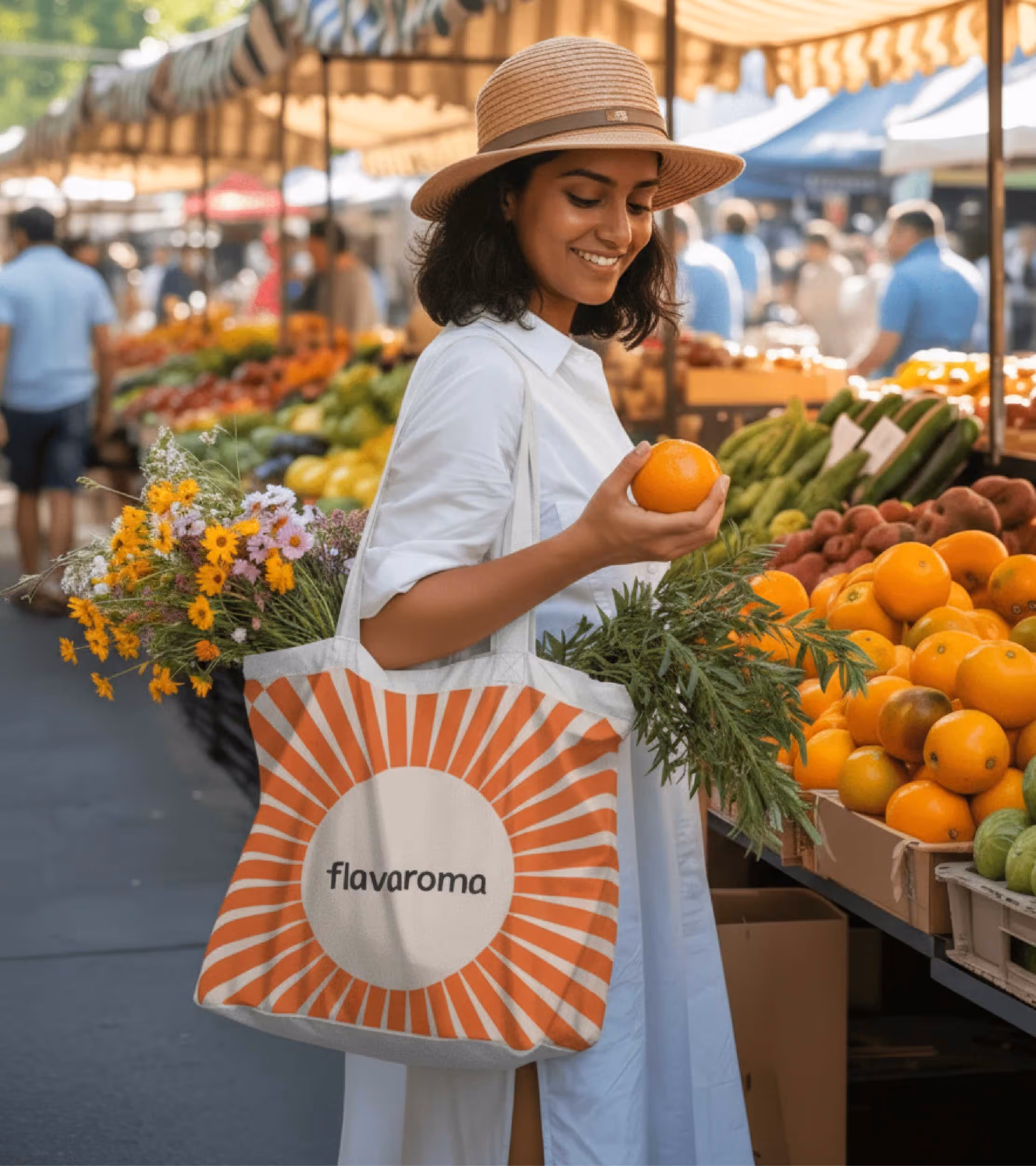
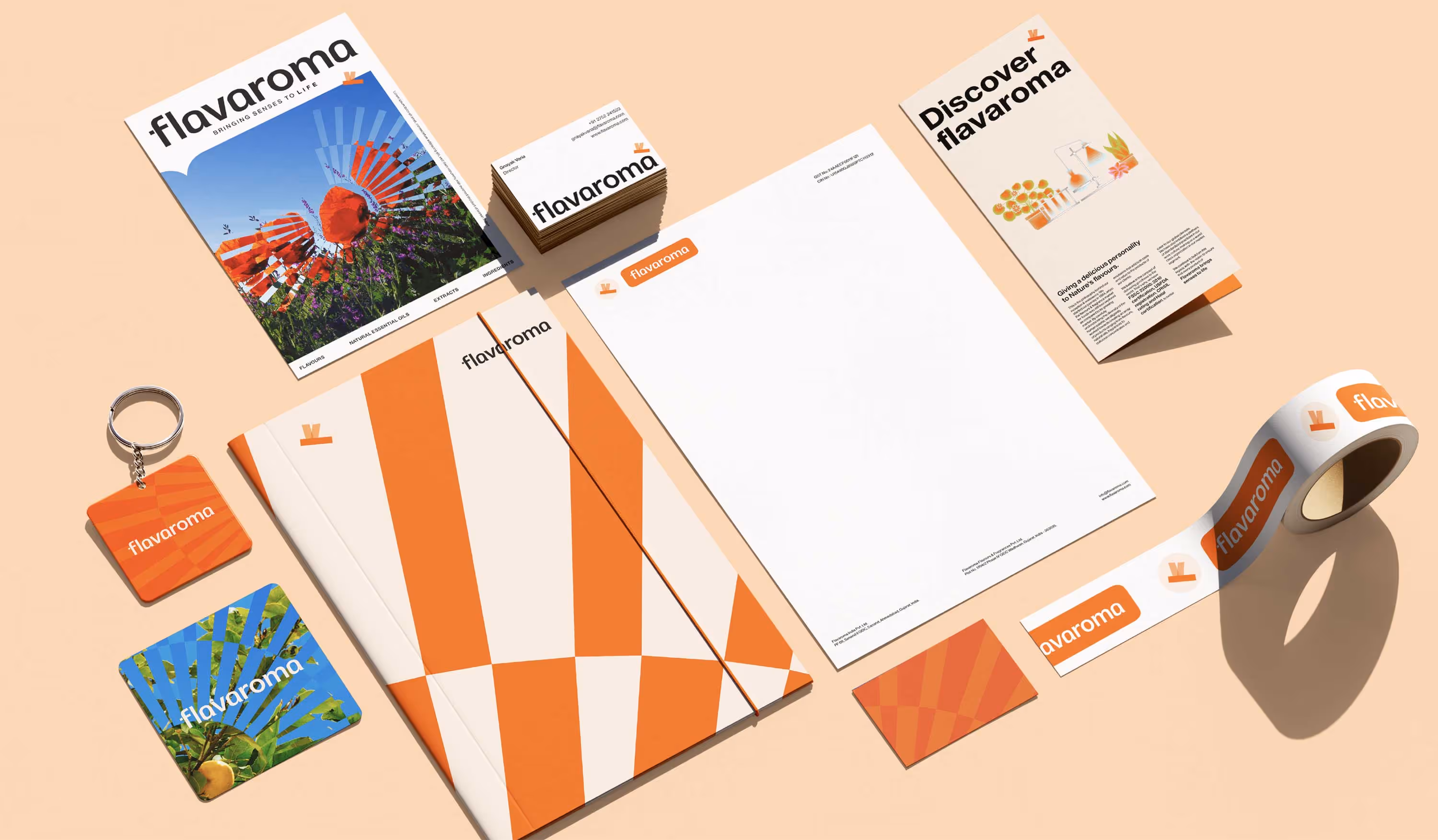
At the heart of Flavaroma is a maker’s mindset, part science, part emotion, entirely craft. Which is why the identity needed to mirror that same balance. The original brand mascot, the bee, became our anchor. Not just as a symbol, but as a storyteller. Simplified and sharpened, the bee’s path is now embedded in the visual language, flowing through layouts, shaping forms, and inspiring motion. Even the brand imagery carries this spirit with custom filters that turn product visuals into sensory cues.
Awakening the visual language
The new identity is designed to shift, calm and minimal on one end, bold and expressive on the other. Every element has purpose and presence, whether it’s used in isolation or as part of a richer composition. From packaging to digital touchpoints, it flexes across Flavaroma’s full spectrum of offerings, creating a brand system that feels consistent yet full of personality. A design language built to engage the senses, purposeful, expressive, and truly Flavaroma.


go back
Shaping the sensory language of a flavour and fragrance brand.
play
pause