Dealshare
Haq se bachao
• Design Strategy • Brand Refresh • Brand Identity • Design System • Brand Guide
Back when most apps were changing the way India shops, Dealshare began with a different ambition: to change the way India saves. In a market racing to deliver faster, Dealshare chose to slow down and focus on what truly matters to its consumers: value. Built for middle-class India, the brand was always about putting the everyday saver at the centre of its story.As Dealshare grew into India’s trusted savings app for groceries, the brand itself evolved, and it was time for its identity to do the same.
Turning savings into a symbol
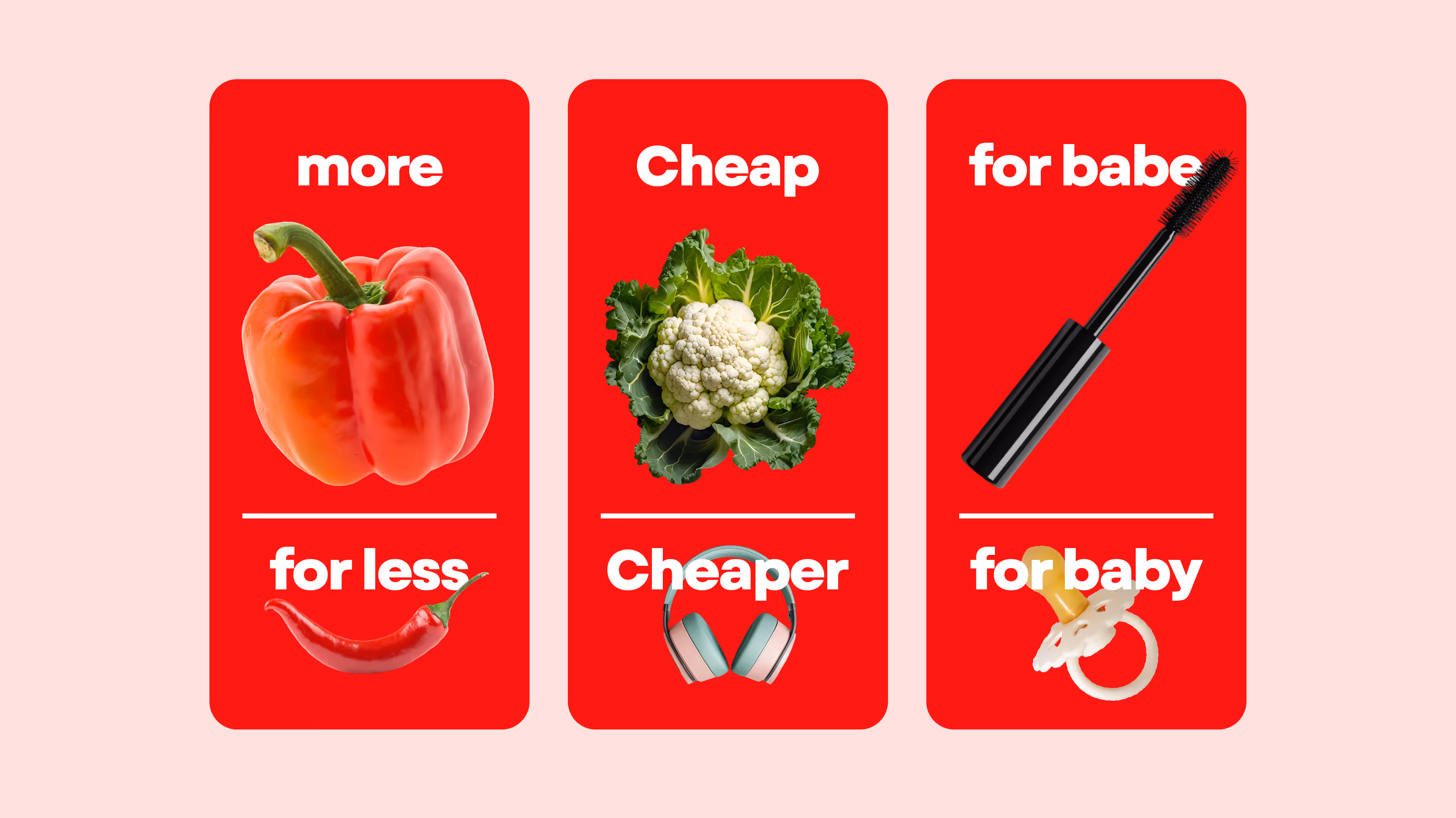
The Indian consumer has always believed that a rupee saved is a rupee earned. Small, consistent savings, whether through a bargain at the market or a discount on essentials, build a sense of control and pride. For the rebrand, the idea was simple. Since every deal on Dealshare helps you save more, why not make saving the core of the brand itself?That thought led to the creation of the Dealshare Currency, a symbol that reminds users that this is more than just another grocery app. It is a platform built around the joy of saving.

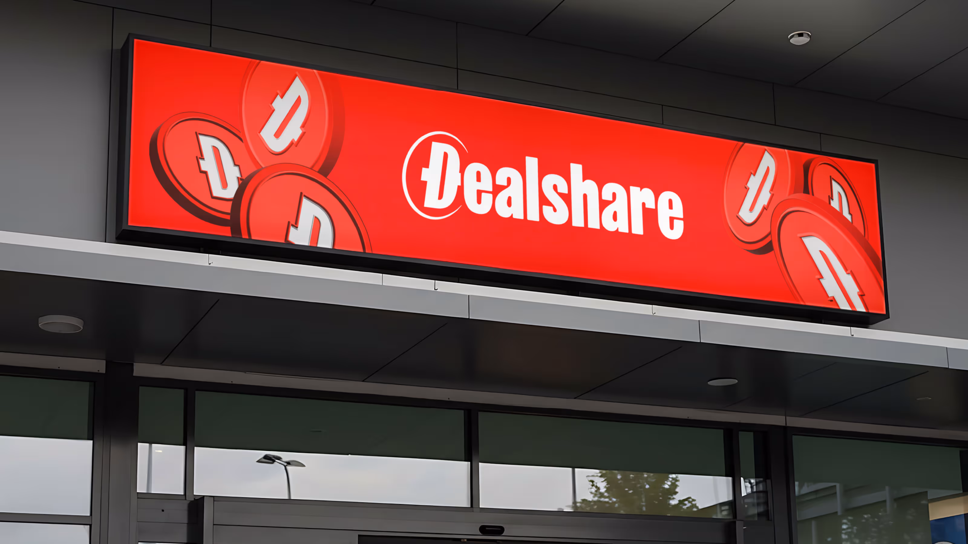
The new face of value
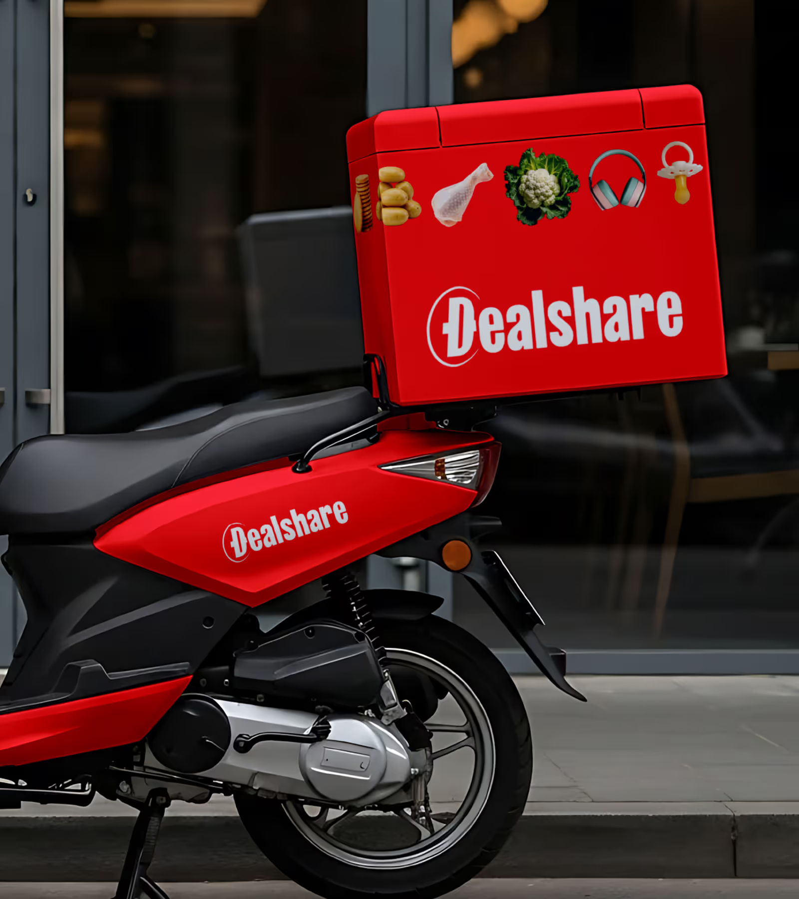
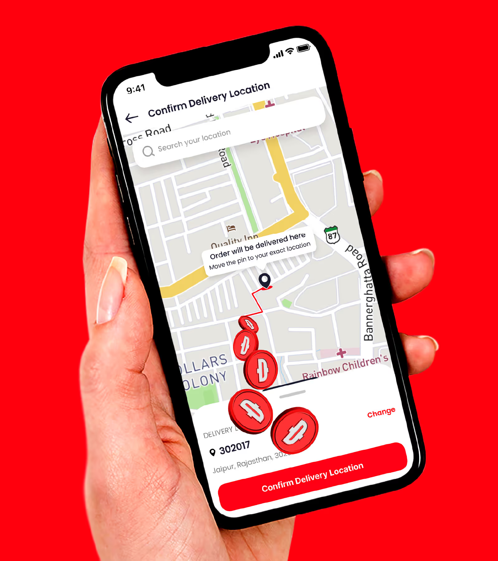
In the new system, savings take centre stage. Coins replace clocks as the pulse of the brand. The new Dealshare Red paints this world of value with warmth and confidence, while the D-symbol helps the brand stand apart, bold, distinct, and refreshingly untypical for the category.

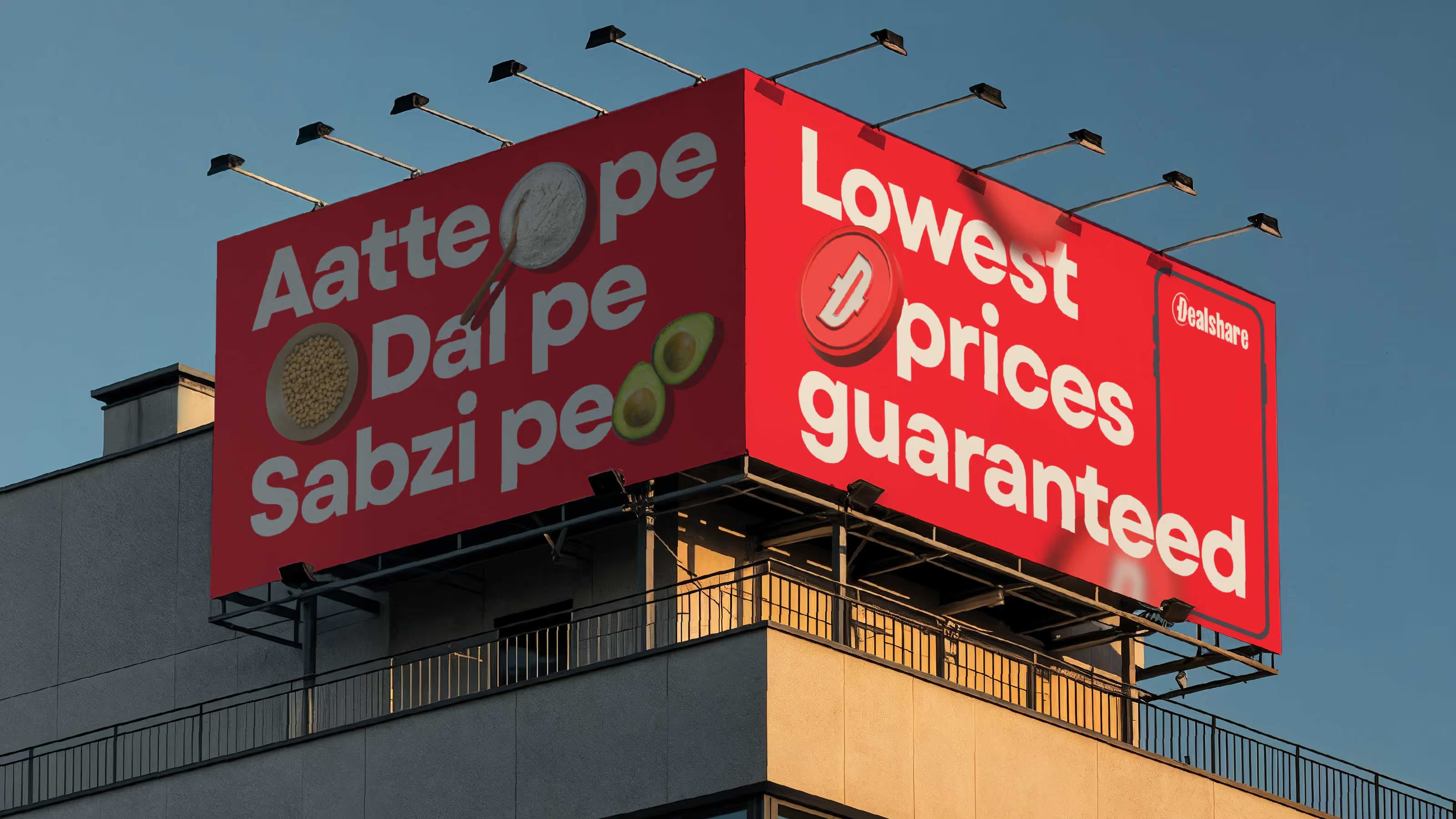
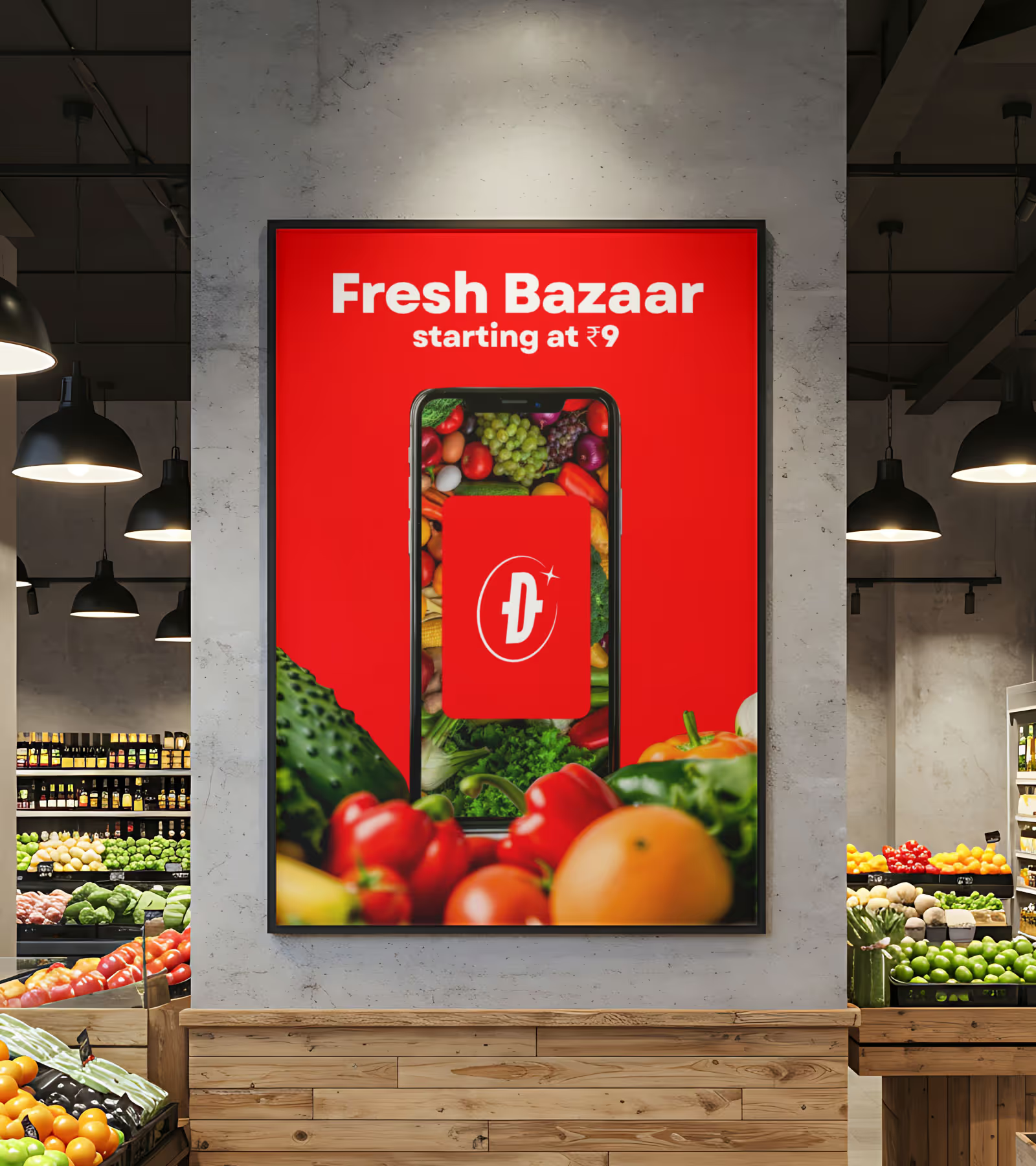
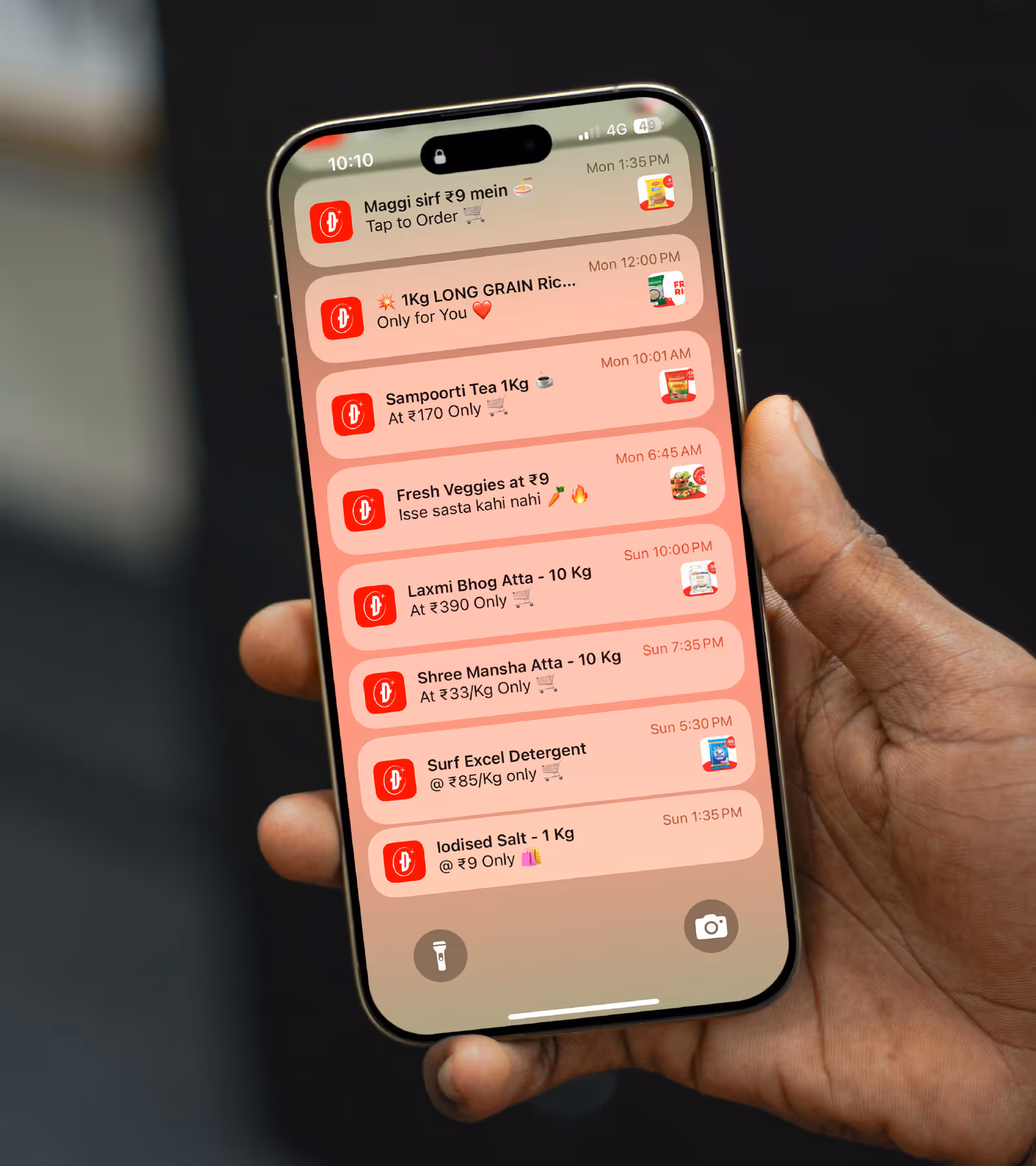
The currency of everyday pride
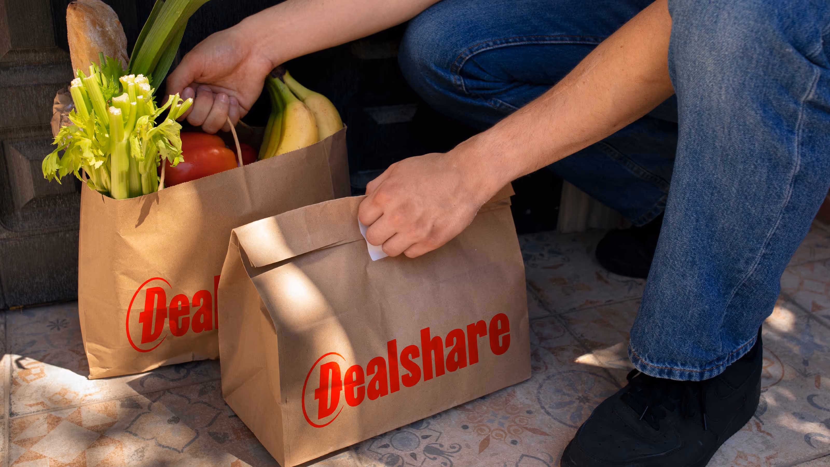
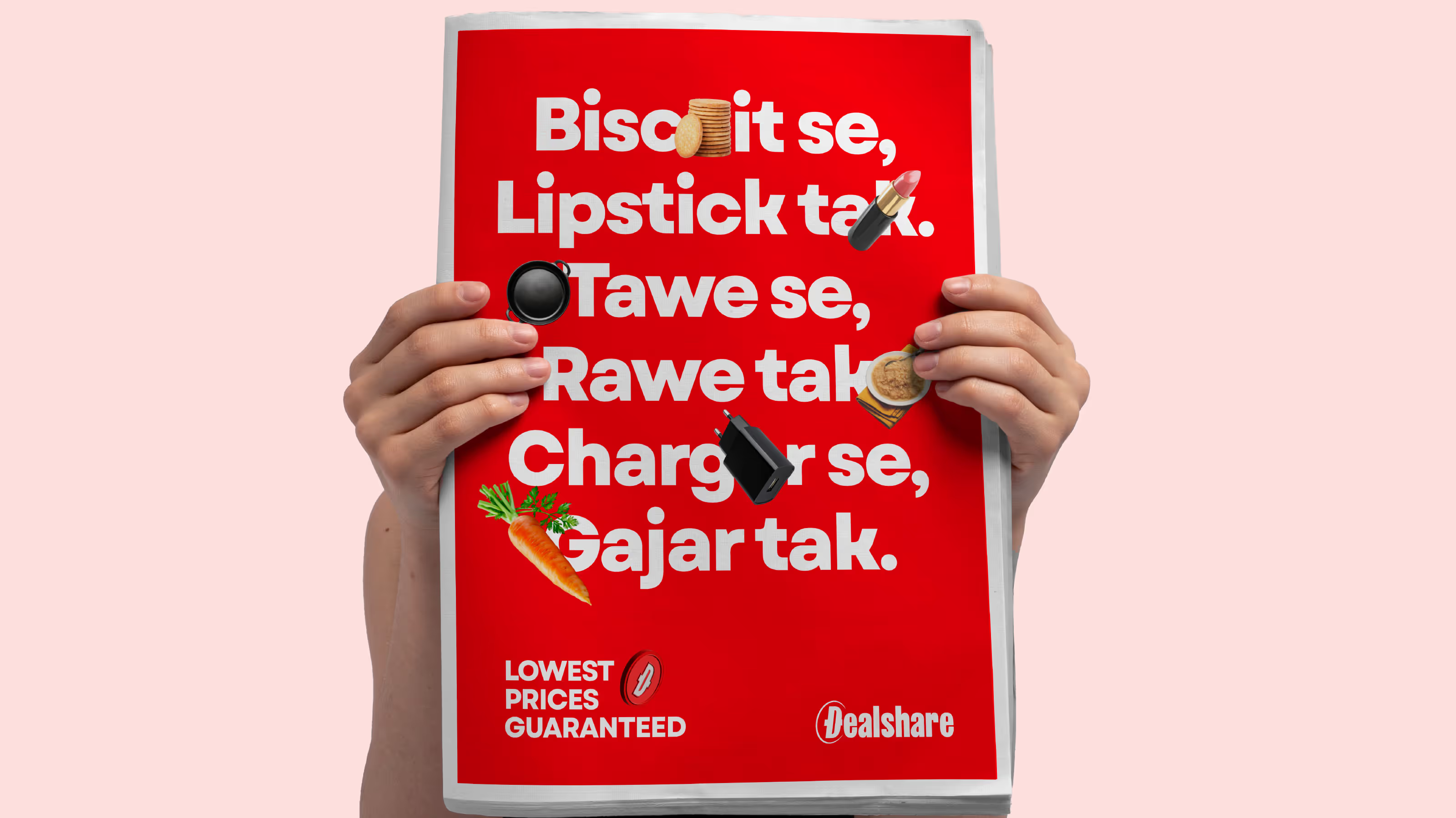
Daily deals now drive the communication. Products, offers, and the Dealshare Currency form the core of every layout, brought together through assets that feel distinctively Dealshare. The result is a brand world that feels new yet known, an evolution that strengthens what the brand has always stood for. Dealshare now represents more than just discounts; it embodies the everyday pride of saving.


go back
Building the engine for value-led commerce in India.
play
pause