Kyzen
A belief before the brand
• Design Strategy • Brand Identity • Brand Experience
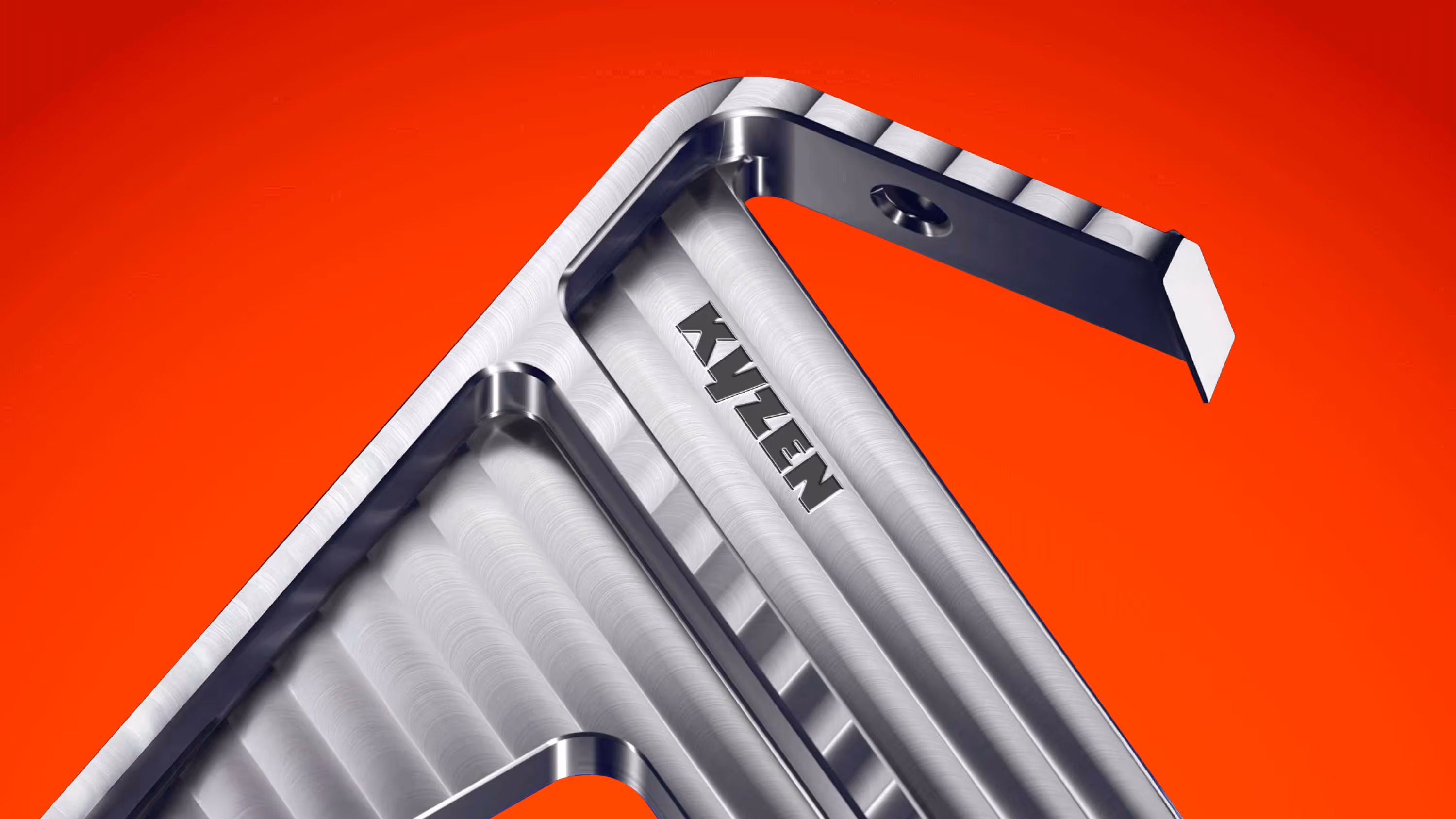
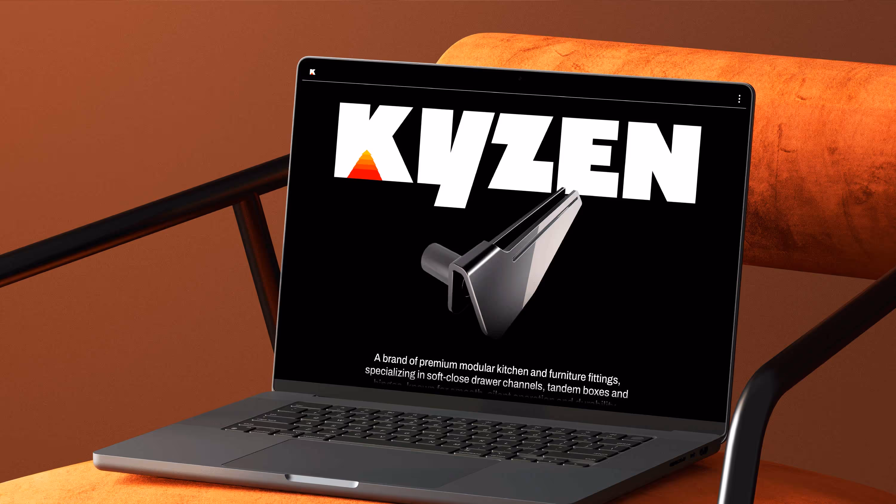
Kyzen is a new entrant in the premium hardware solutions space, offering world class hinges, channels, and fittings. The brand began with one simple belief: that better is not a milestone, but a habit. The name Kyzen carries the philosophy at the heart of the brand. Drawn from two ideas, Kai meaning change or improvement and Zen meaning good or better, it reflects a mindset of constant progress. Together, they articulate Kyzen’s purpose of continually improving towards peak performance. Our role was to give form to this belief and translate it into a brand that feels confident without being loud, and refined without being distant.
A name that sets the design
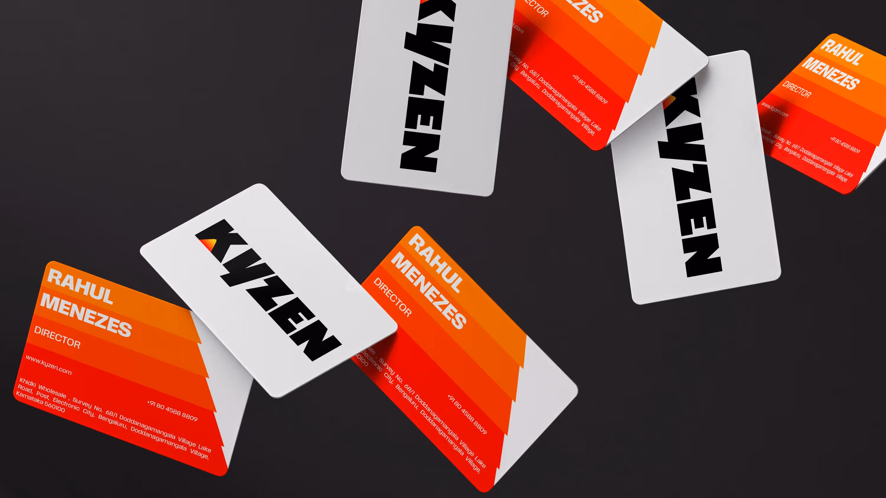
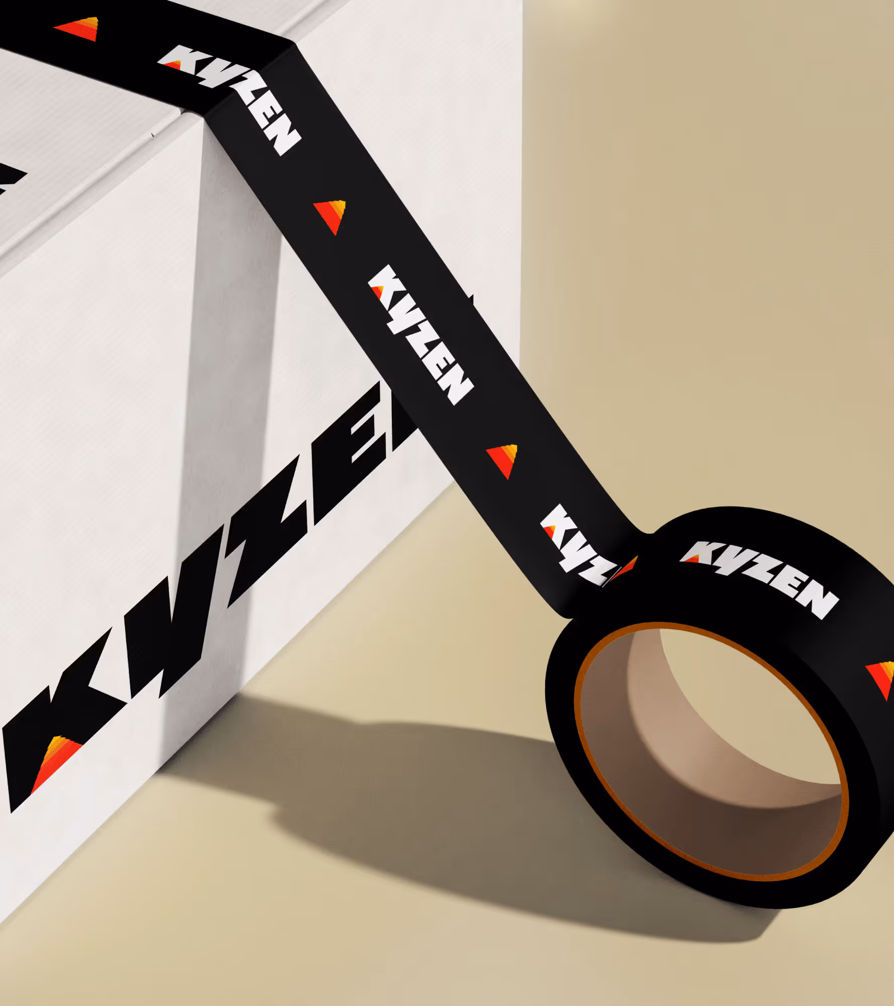
We approached Kyzen’s identity as an extension of how its products behave. As the brand strives to do better with every iteration, the identity needed to express that same upward intent. A simple triangular form representing a peak became our starting point. From there, it evolved into a dynamic typographic system that feels engineered. The logo mark becomes a symbol of mastery, rooted in Kyzen’s belief that improvement is a quiet, continual act. A peak you may not notice at first glance, but one that begins to anchor the brand the longer you live with it.

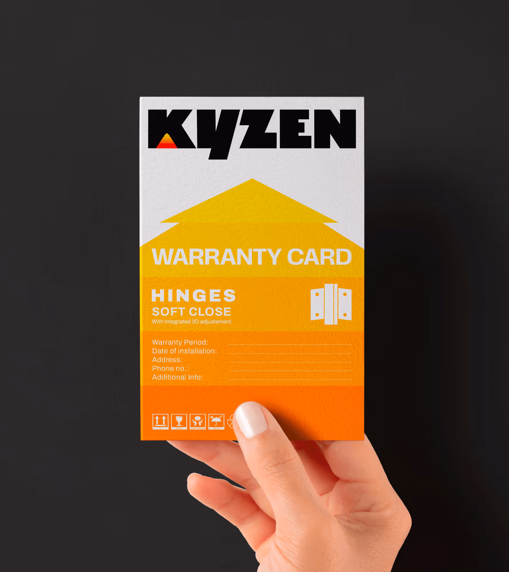
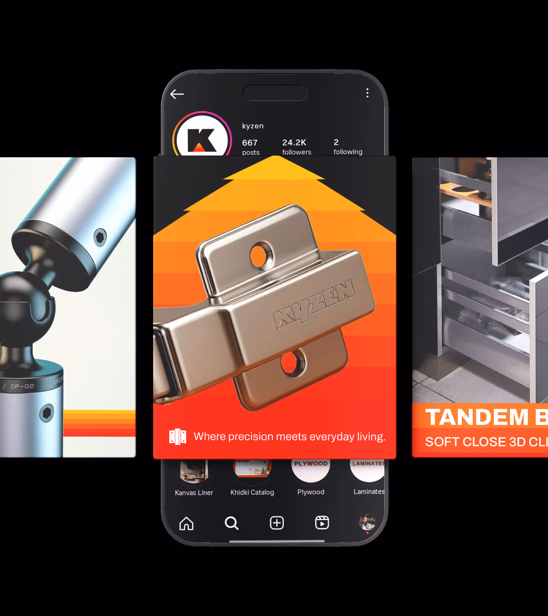
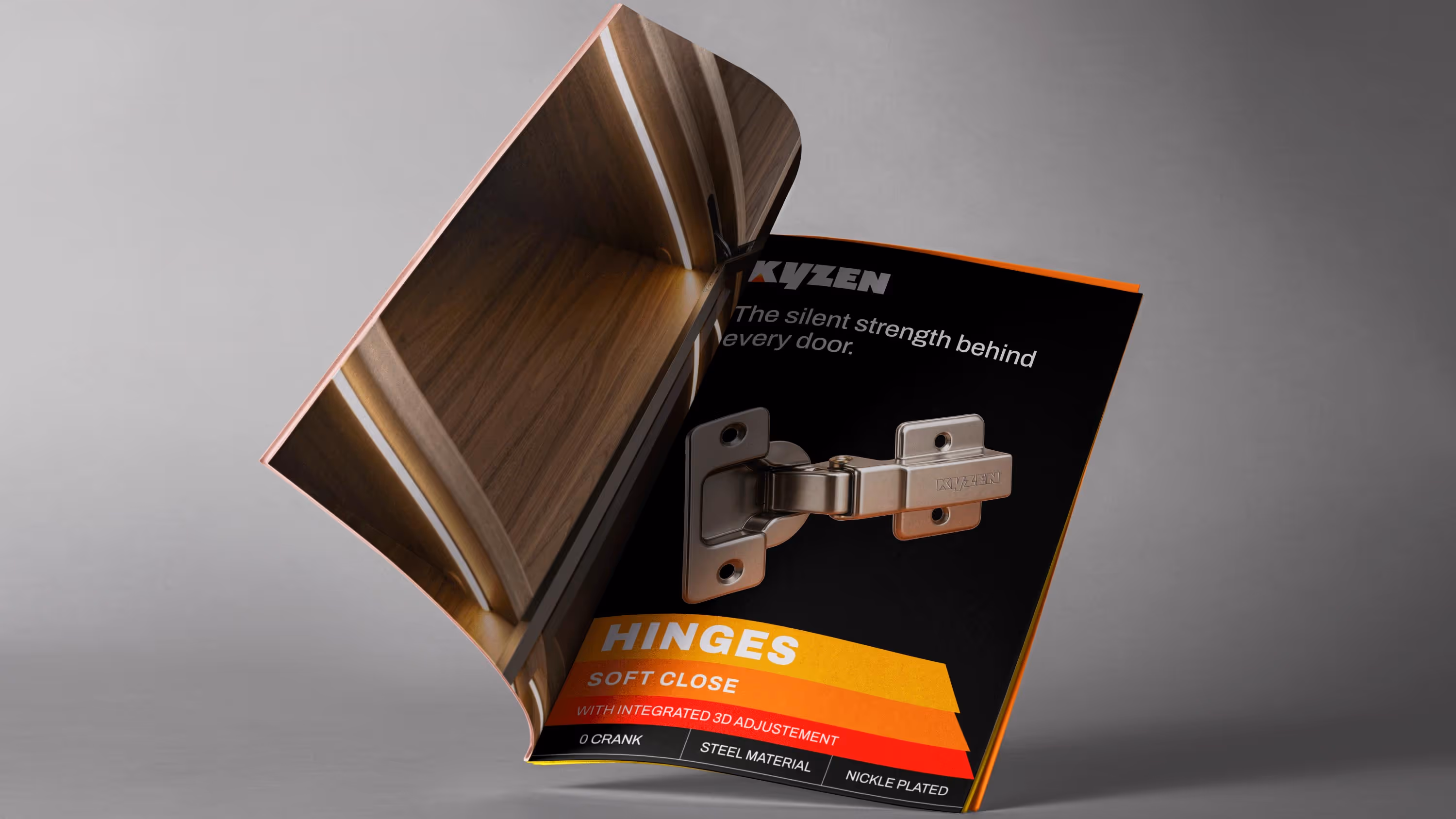
A system design for shelf
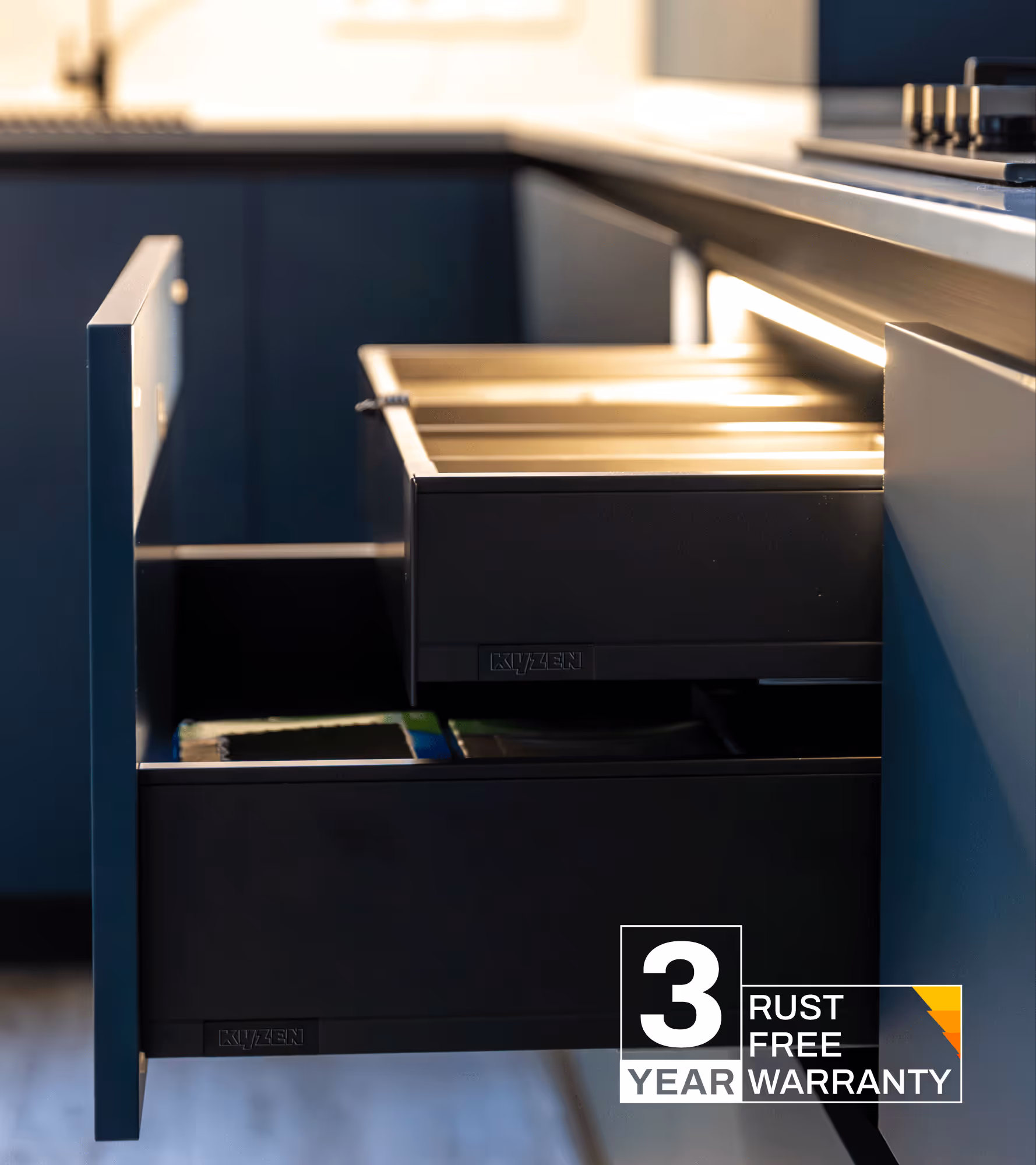
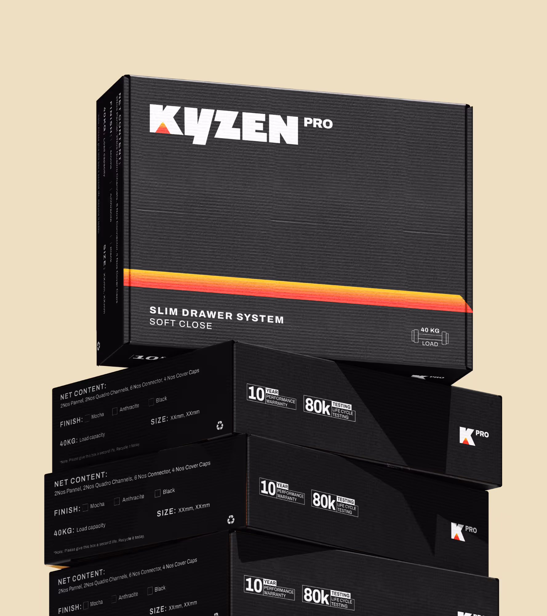
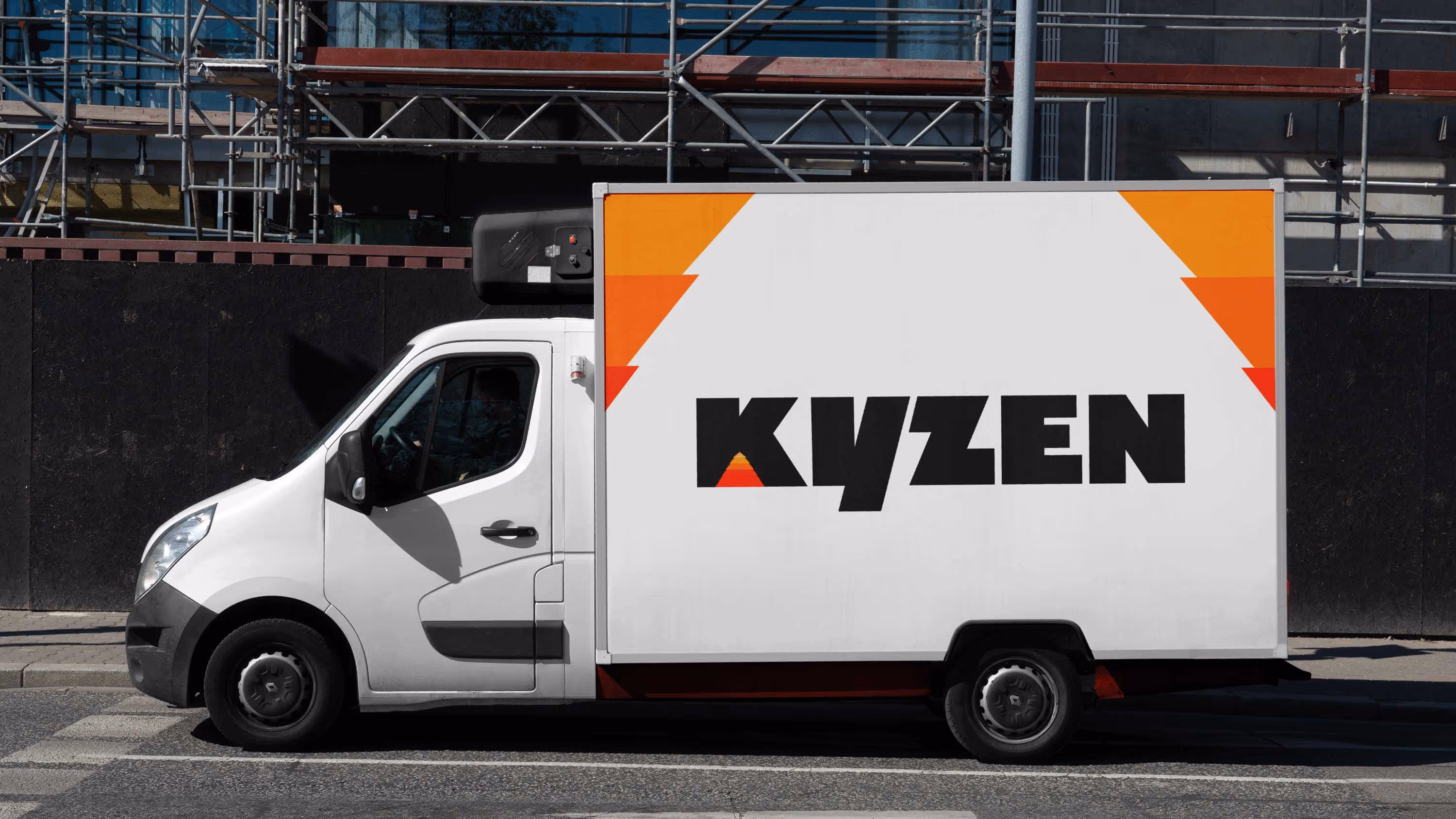
Since the idea of peak is closely tied to progression, the colour palette was designed to mirror that sense of continual refinement. The colours are layered and composed with depth and contrast, rising subtly rather than abruptly. Extending the idea of the peak, the design system uses depth and layered colour to guide the eye, bringing clarity and order to information without adding visual noise. The packaging brings this system together, translating it into a tactile, shelf-ready experience that sets Kyzen apart within the category.

go back
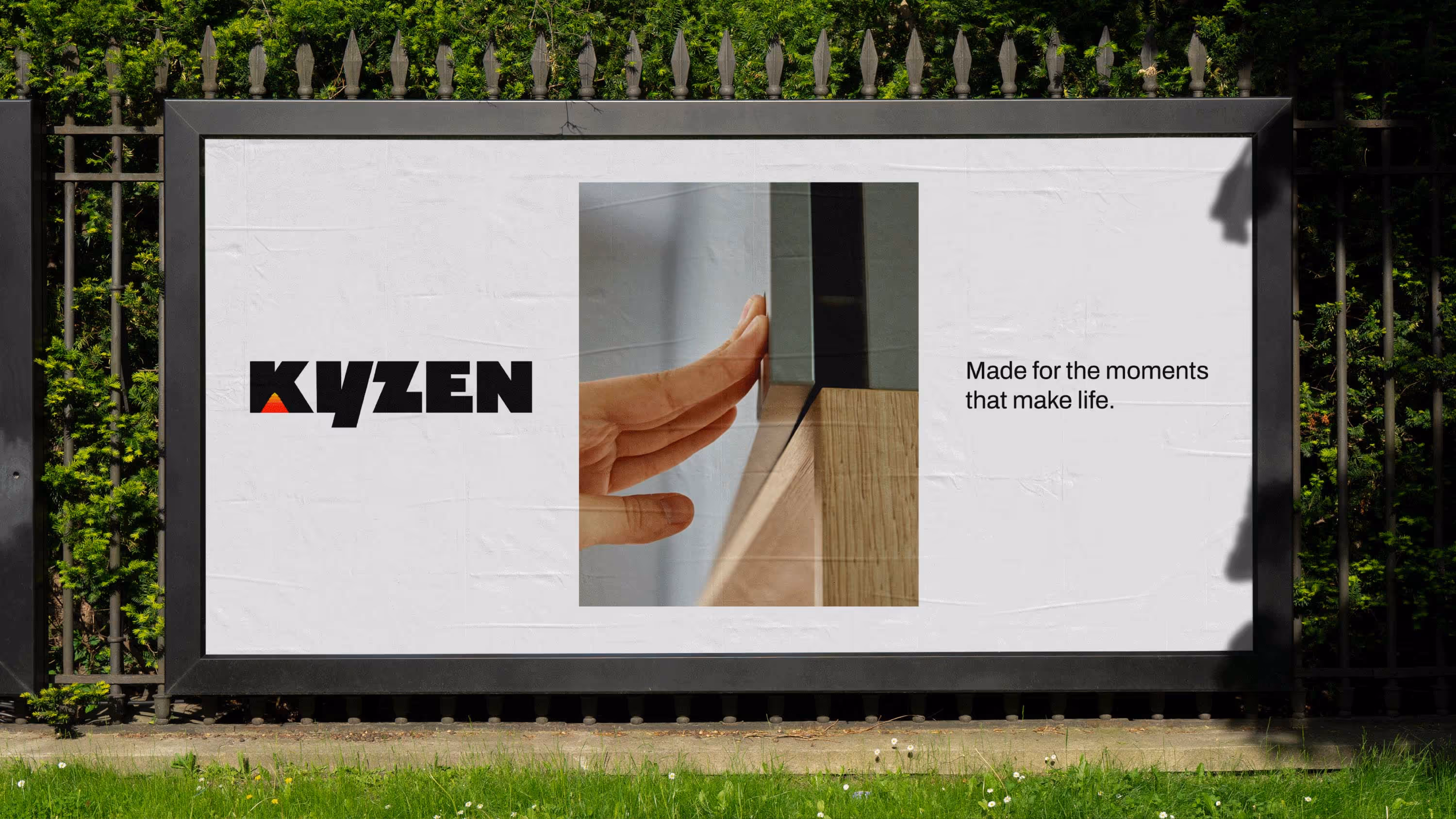
Giving purpose a place in the premium hardware category.
play
pause