Kimbal Hes

Designing for India’s Smart Energy Future
• UI • UX • Strategy • Concept
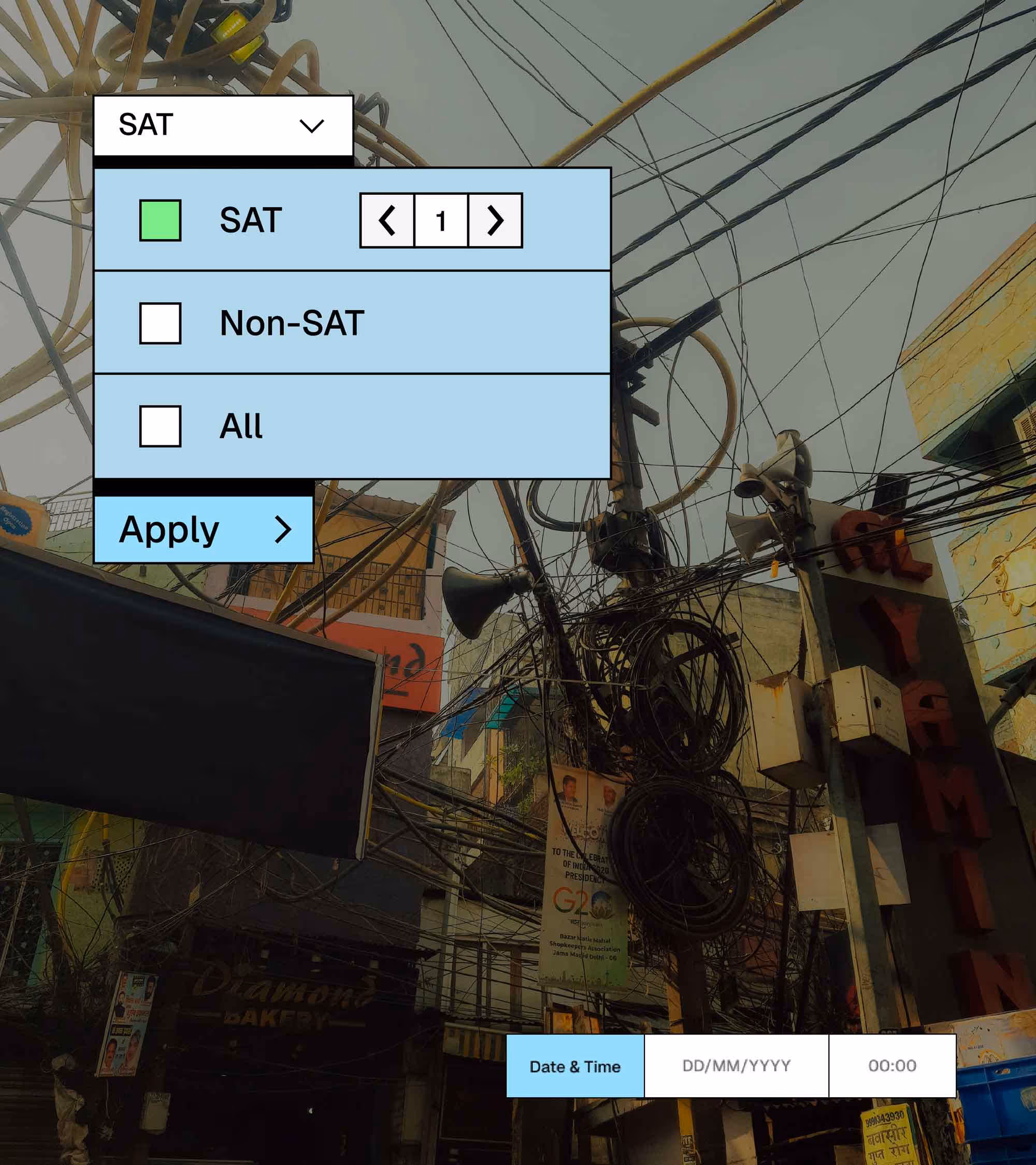
India’s smart meter ecosystem is vast, and even a minor lag or error can lead to significant disruptions. Kimbal’s smart meter management app was built to do just one task—cut through complexity and deliver precision at scale. The challenge? Transforming an overloaded system of data into an intuitive, error-free experience—Because when a country runs on energy, 99% accuracy still leaves too much in the dark.
Building data architecture
We began by working closely with Kimbal's team to map the complete metering ecosystem. Together, we analyzed every data input point, pinpointed system bottlenecks, and identified the most time-intensive daily tasks. Our discovery process focused on three key areas: potential failure points in the workflow, common pain points leading to human error, and the most frequent user journeys.
These insights became the blueprint for our information architecture - a structured framework that organized data hierarchies, streamlined user flows, and implemented intuitive categorization. The most radical change? We gave technicians a single scrolling customised dashboard that consolidates what they used to piece together from multiple screens. The result was a system where information found users, rather than the other way around.
Engineering Simplicity into Complexity
Kimbal isn't just managing meters—they're reimagining how energy becomes efficient and reach everyone. So, we crafted a design system to match that vision: a modular grid that adapts as seamlessly as the infrastructure it monitors. We categorised the data in two parts - fixed and flexible. Important information forms the base grid, while secondary data appears only when needed—transforming clutter into clarity. No more hunting through tabs or memorizing pathways. Now, no meter detail is more than three taps away, and smart filters let users slice data in seconds.
Clearing the visual noise
With technicians processing vast amounts of data daily, our color system needed to work harder than most. We implemented a restrained palette where only mission-critical information draws attention—allowing users to focus without distraction. Green signals optimal performance, red demands immediate action, creating instant visual understanding even in high-pressure situations. Complementing this approach, we introduced clean, purposeful iconography to balance the numerical intensity of the interface. These visual cues transform raw data into scannable information, ensuring both clarity and efficiency in every interaction.
The invisible Language of Efficiency
The redesigned platform transformed how users interacted with smart meter data. What was once a maze of graphs and tables became an intuitive, high-speed interface. Technicians could now identify and resolve issues in seconds, minimizing human error and maximizing efficiency. True infrastructure fades into the background. No more wrestling with the interface—just clean sightlines between problem and solution. A silent partner to the people keeping the lights on.
Reimagining smart meter management across India.
play
pause