One Street up
The street never stands still
• Design Strategy • Brand Refresh • Brand Identity • Design System • Product Design • Brand Guide
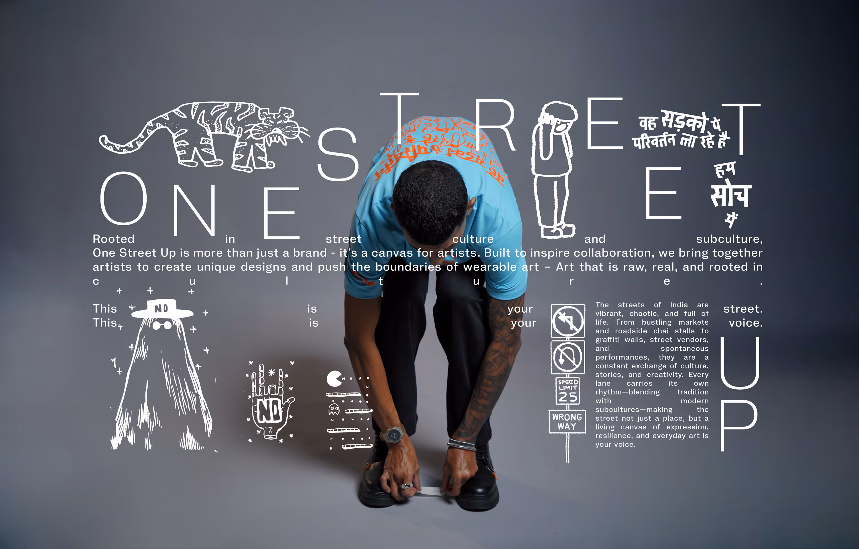
In India, a street changes by the second. What you see is already layered over by something else. A sound. A slogan. A vendor. A protest. A pause. It is chaotic, expressive, alive. And impossible to freeze. One Street Up comes from this energy. A streetwear brand inspired by Indian streets not as an aesthetic, but as a living system constantly shaping culture, language, and identity.
One Street Up approached us to design T shirts. But as we started working on the graphics, it became clear that the street does not repeat itself. And a brand inspired by it should not either.
One Street Up approached us to design T shirts. But as we started working on the graphics, it became clear that the street does not repeat itself. And a brand inspired by it should not either.
Letting the identity move
Instead of treating the brand identity as a fixed mark, we suggested turning it into something dynamic. An identity that evolves the way the street does. The logo became a system. While parts of it stayed anchored, its centre kept changing, acting as a canvas for stories pulled from the street. From everyday slang to quiet resistance. From nature to noise. From the mundane to the magnificent.
An identity that does not sit still. Because the street never does.
An identity that does not sit still. Because the street never does.


The brand lives on the street
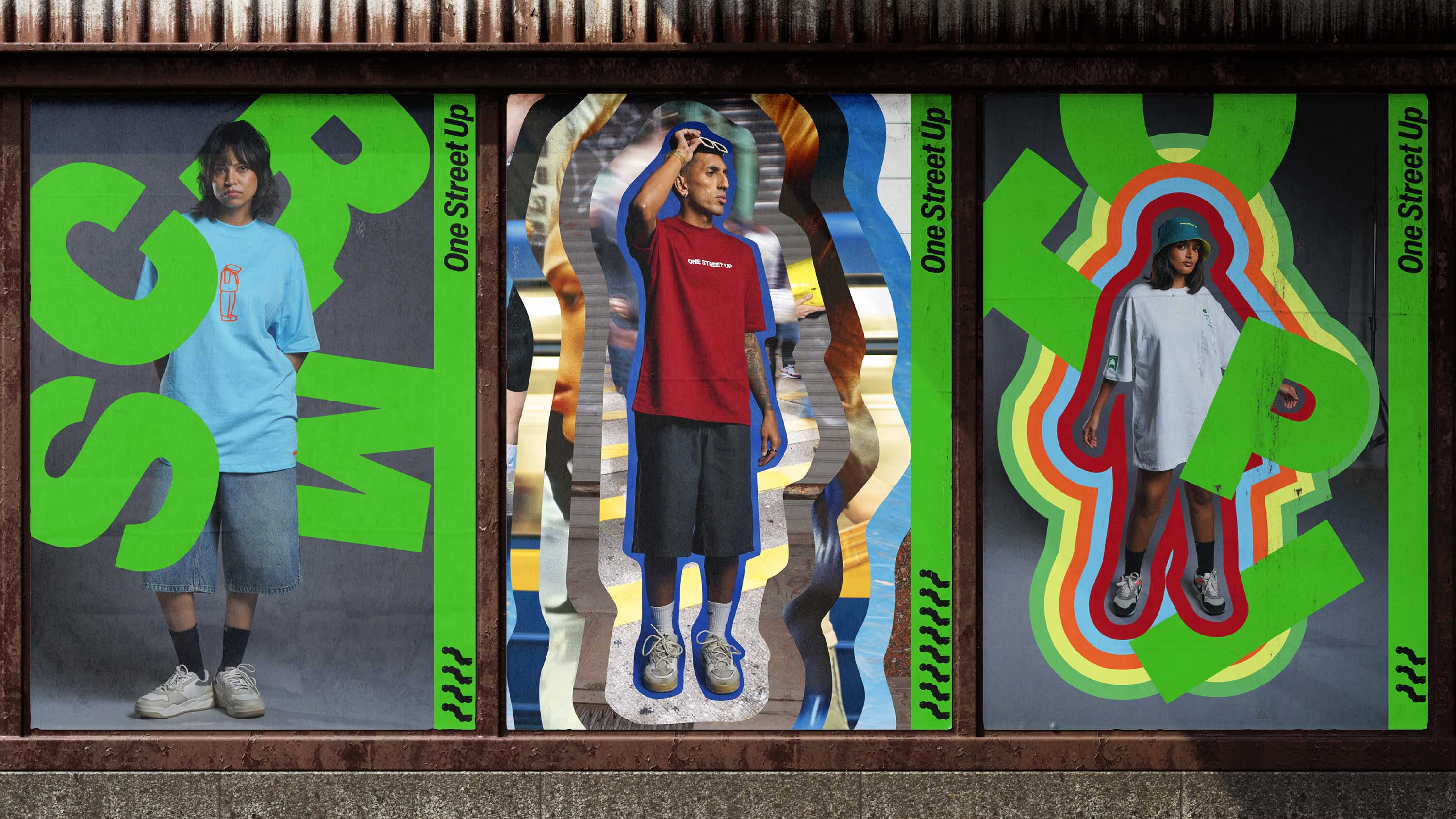
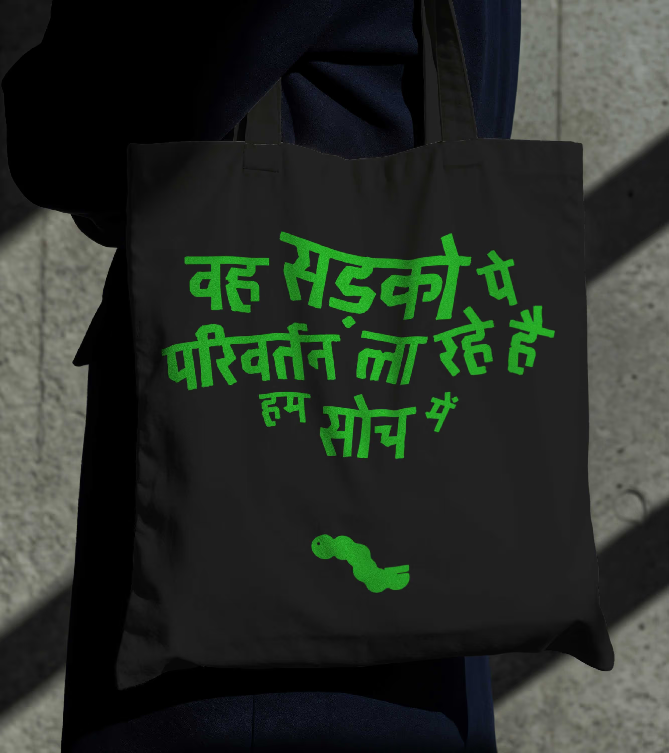
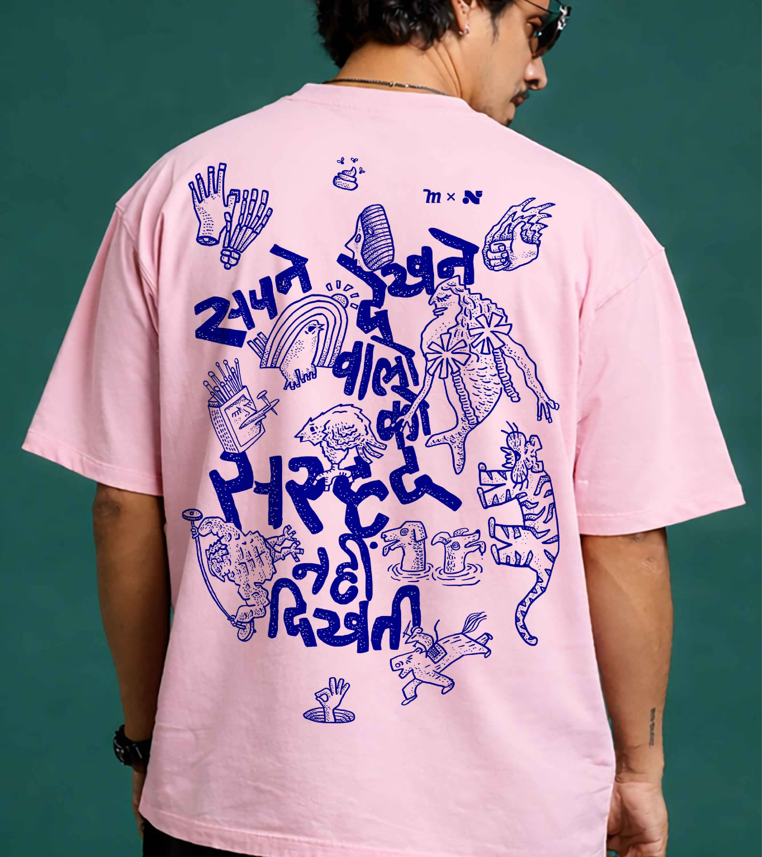
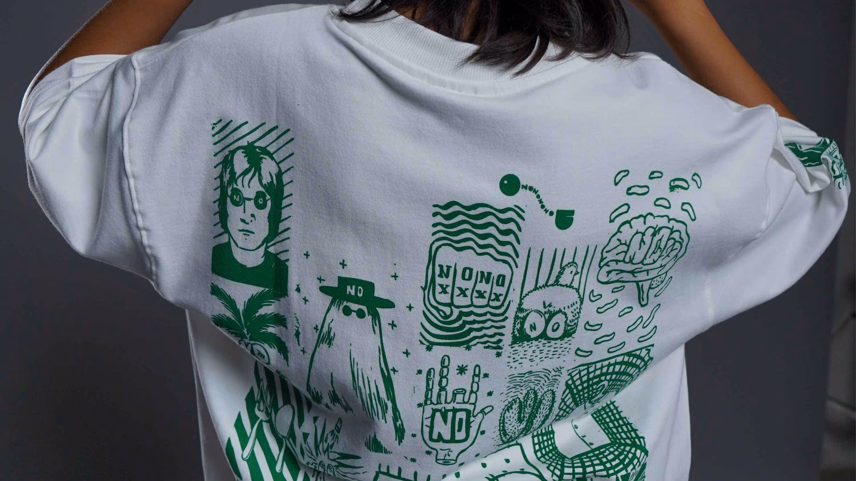
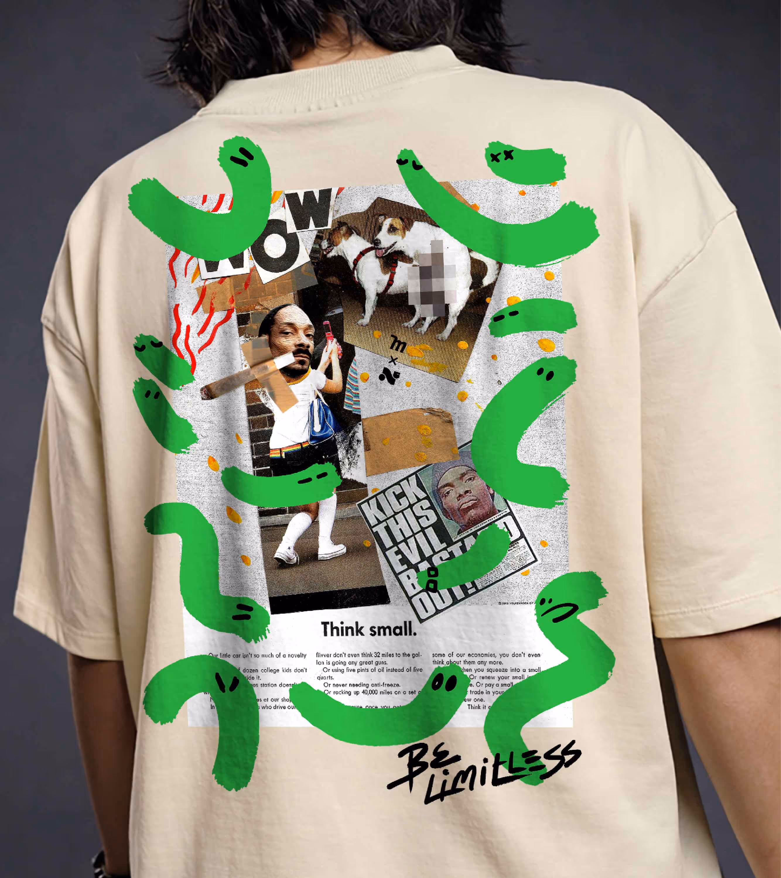
We designed T-shirts for One Street Up, each one treated as a surface for expression, not merchandise. Many of them function as standalone art pieces, carrying ideas as much as visuals.
The identity lived primarily on garments and the website. But its most natural home turned out to be the streets themselves. Because the logo was dynamic, its elements were converted into stickers, scattered across lanes, walls, and corners. Much like Indian roads, the brand began appearing in fragments, repetitions, overlaps. Always present. Never uniform.
The identity lived primarily on garments and the website. But its most natural home turned out to be the streets themselves. Because the logo was dynamic, its elements were converted into stickers, scattered across lanes, walls, and corners. Much like Indian roads, the brand began appearing in fragments, repetitions, overlaps. Always present. Never uniform.


Shaping the sensory language of a global flavour and fragrance brand
play
pause