Pilgrim

World’s beauty secrets for you
• Design Strategy • Brand Refresh• Brand Identity • Design System  • Brand Guide
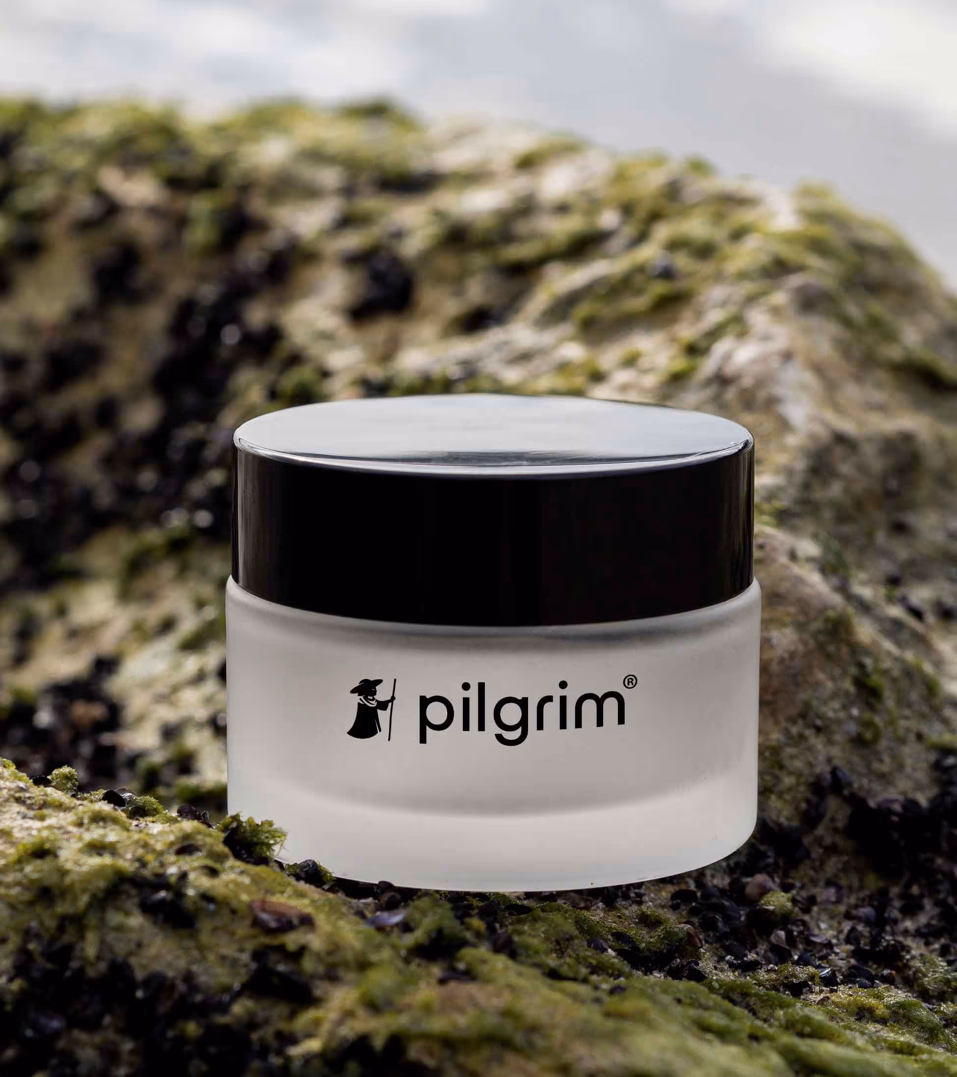
Pilgrim explores the various beauty secrets that take place around the world and brings them to consumers in India. From places to practices, rituals to routines, Pilgrim is bringing the best possible skincare solutions from around the world. They approached us to help them refresh their brand identity and visual world in a way that allows their consumers to discover different world beauty secrets, along with what makes Pilgrim different.
Welcoming the world of circles
Our challenge was to carve out a distinct space for Pilgrim in the crowded Indian skincare market. We began by anchoring the identity in the brand promise — bringing global beauty secrets to India. The logotype and visual language emerged from this idea, with circular forms referencing the globe and acting as intuitive design tools to simplify dense information. The visual language evolved from circles, becoming a supporting element in breaking down the excessive information the brand needed to communicate.
Romanticizing Skin Care
To reflect Pilgrim’s seamless approach to beauty, we chose nude as the brand’s core colour — a soft, grounding shade that ties the identity together. Circles framed different beauty narratives, while a fresh, approachable voice added personality. We also created photography principles that captured not just the product, but the experience — highlighting personal rituals and building a visual world that feels both romantic and real.
Global skincare, made easy and accessible with design.
play
pause