Rise India
A website that knows how to move.
• Website Design • UI/UX
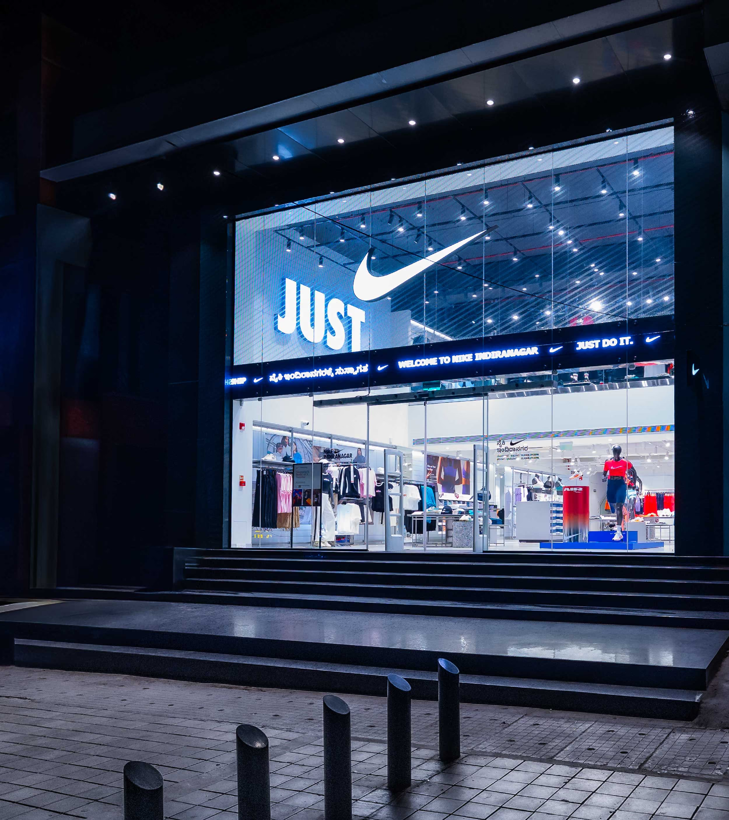
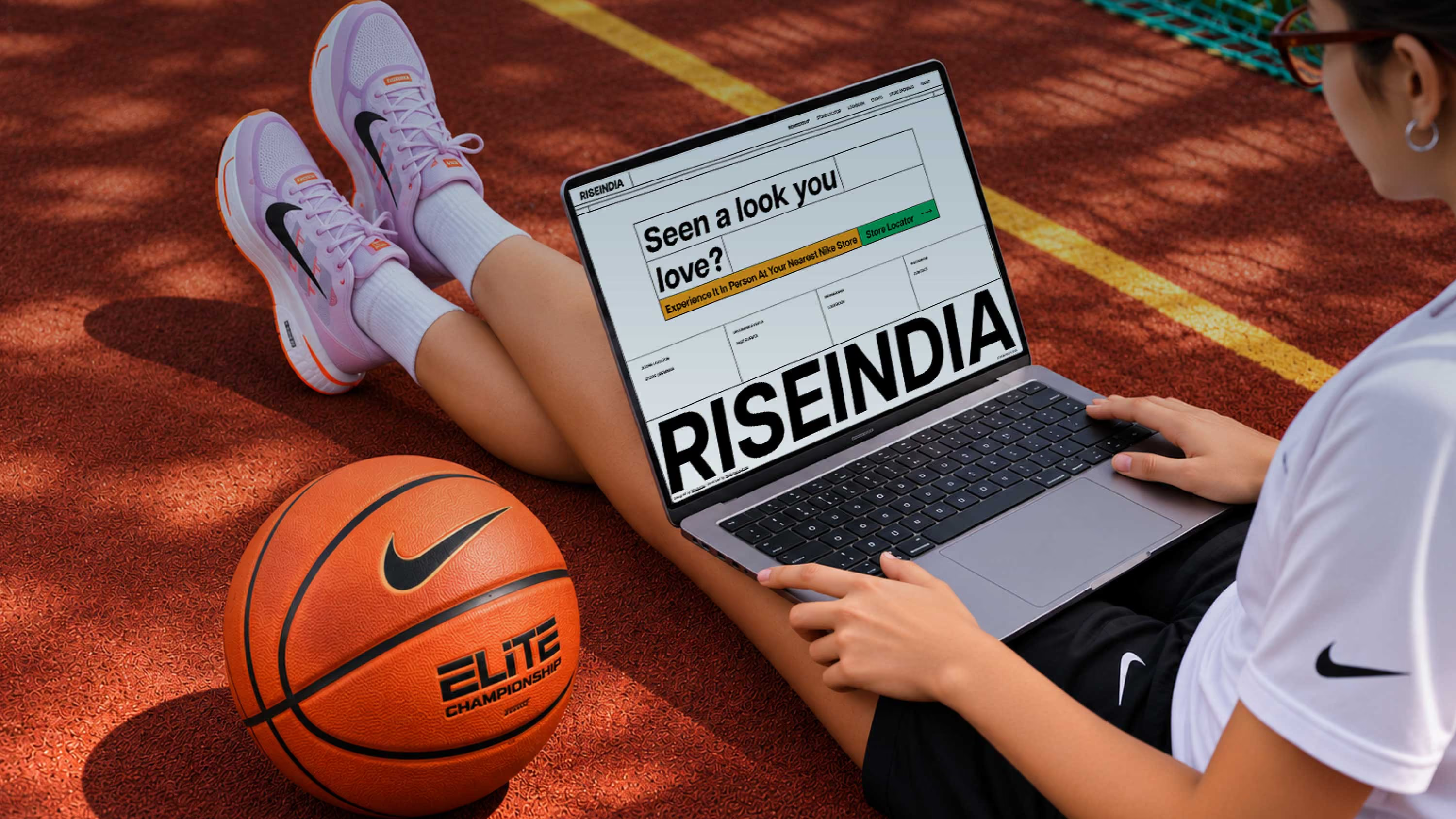
RISEINDIA brings Nike closer to its community in India. From membership benefits and exclusive drops to events, store experiences and everything happening around the brand, there's a lot to keep up with. And a whole lot of energy to capture.
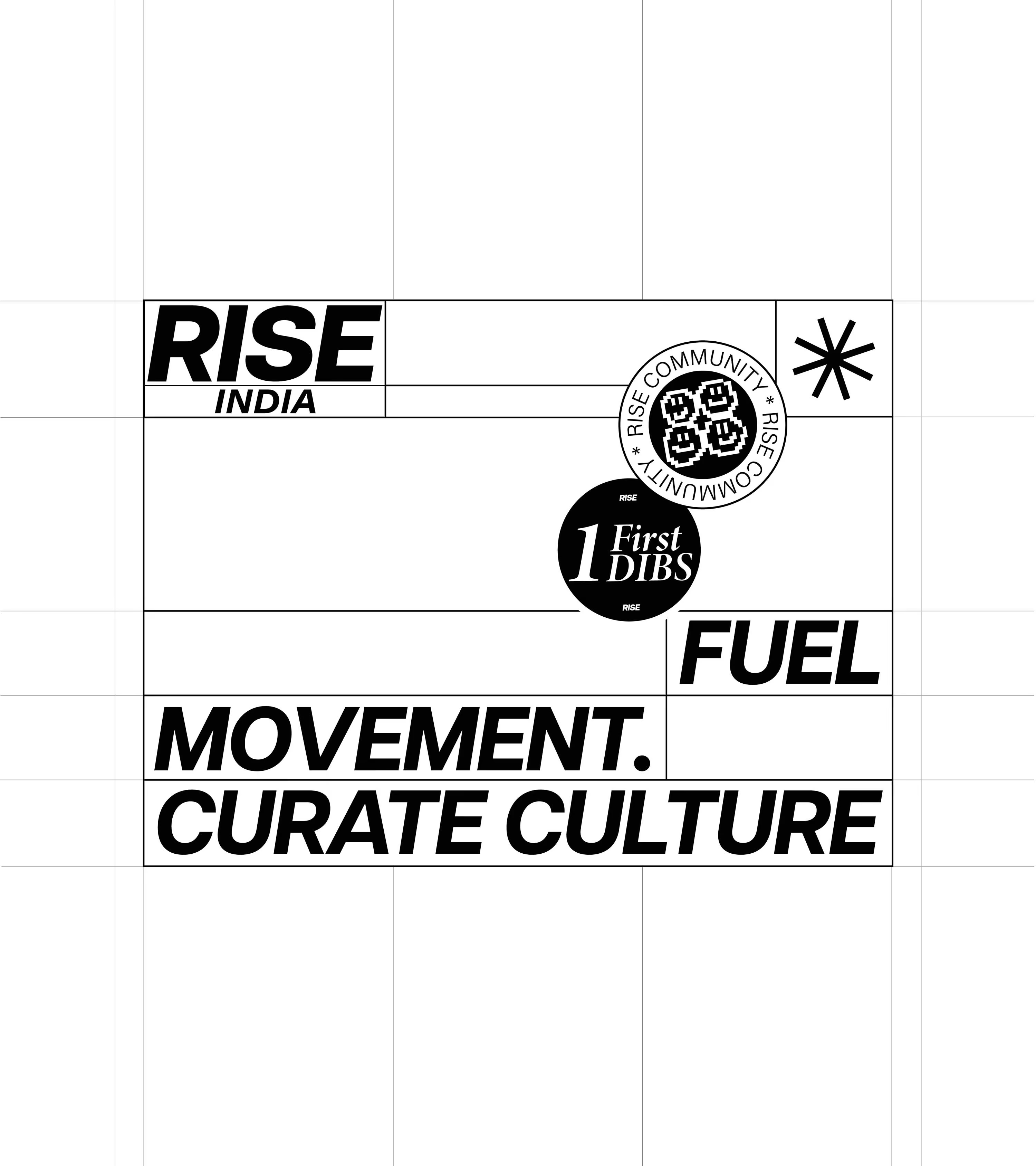
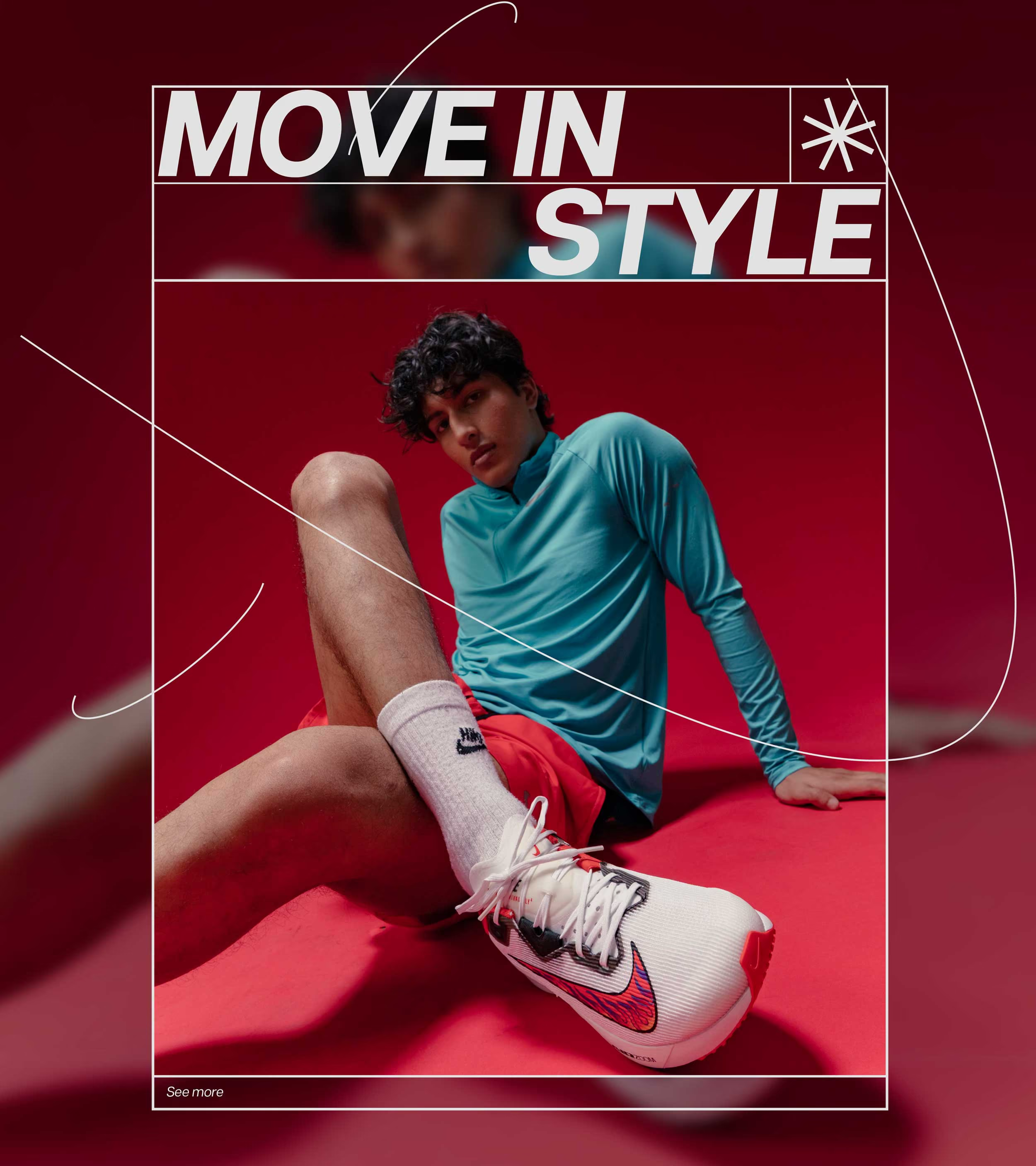
The brand already had a well-defined visual language. Our job wasn't to reinvent it. It was to take it somewhere new. To translate its energy into a digital experience that felt just as alive as the community it was built for.
The brand already had a well-defined visual language. Our job wasn't to reinvent it. It was to take it somewhere new. To translate its energy into a digital experience that felt just as alive as the community it was built for.
Multi-way movement
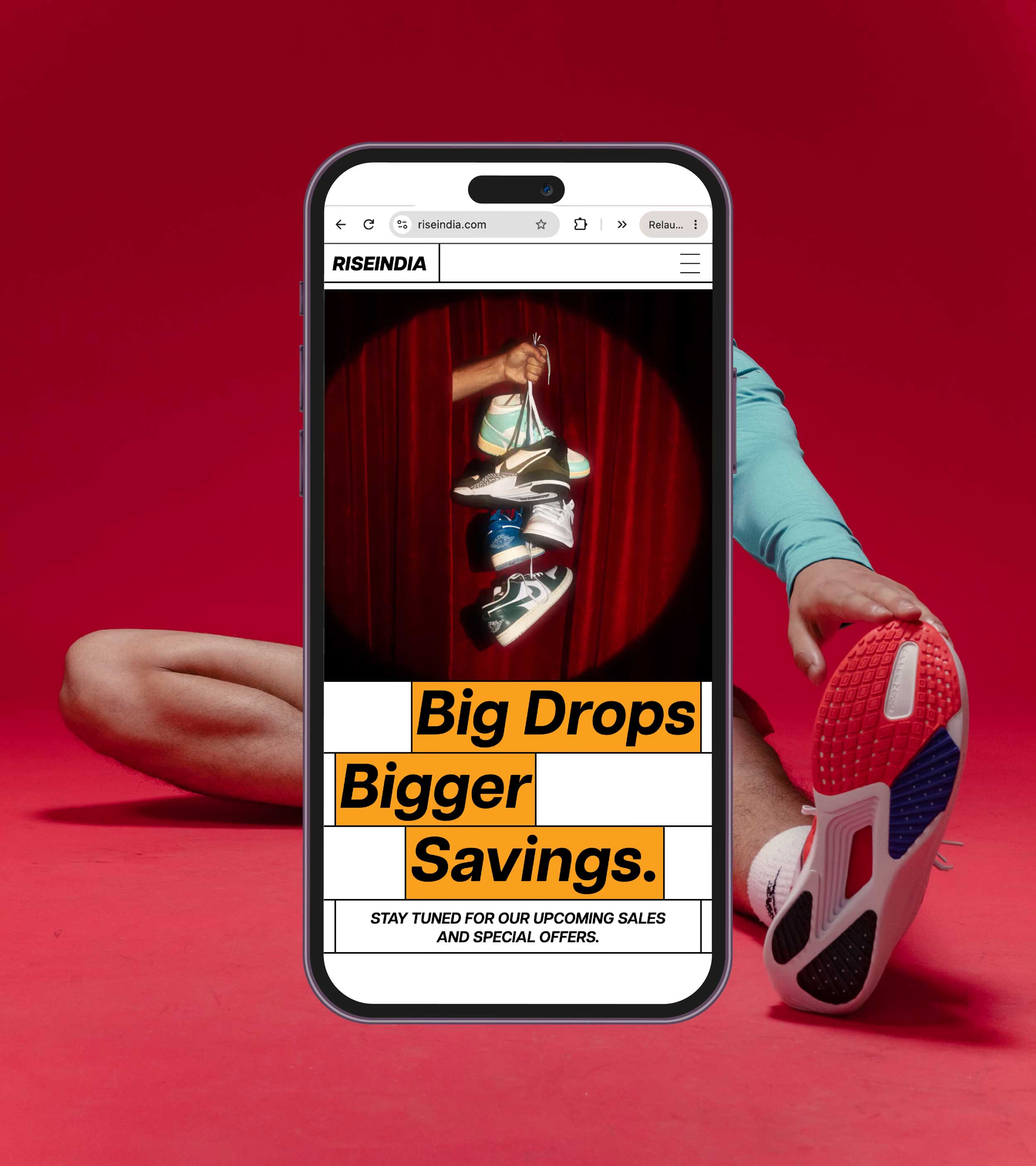
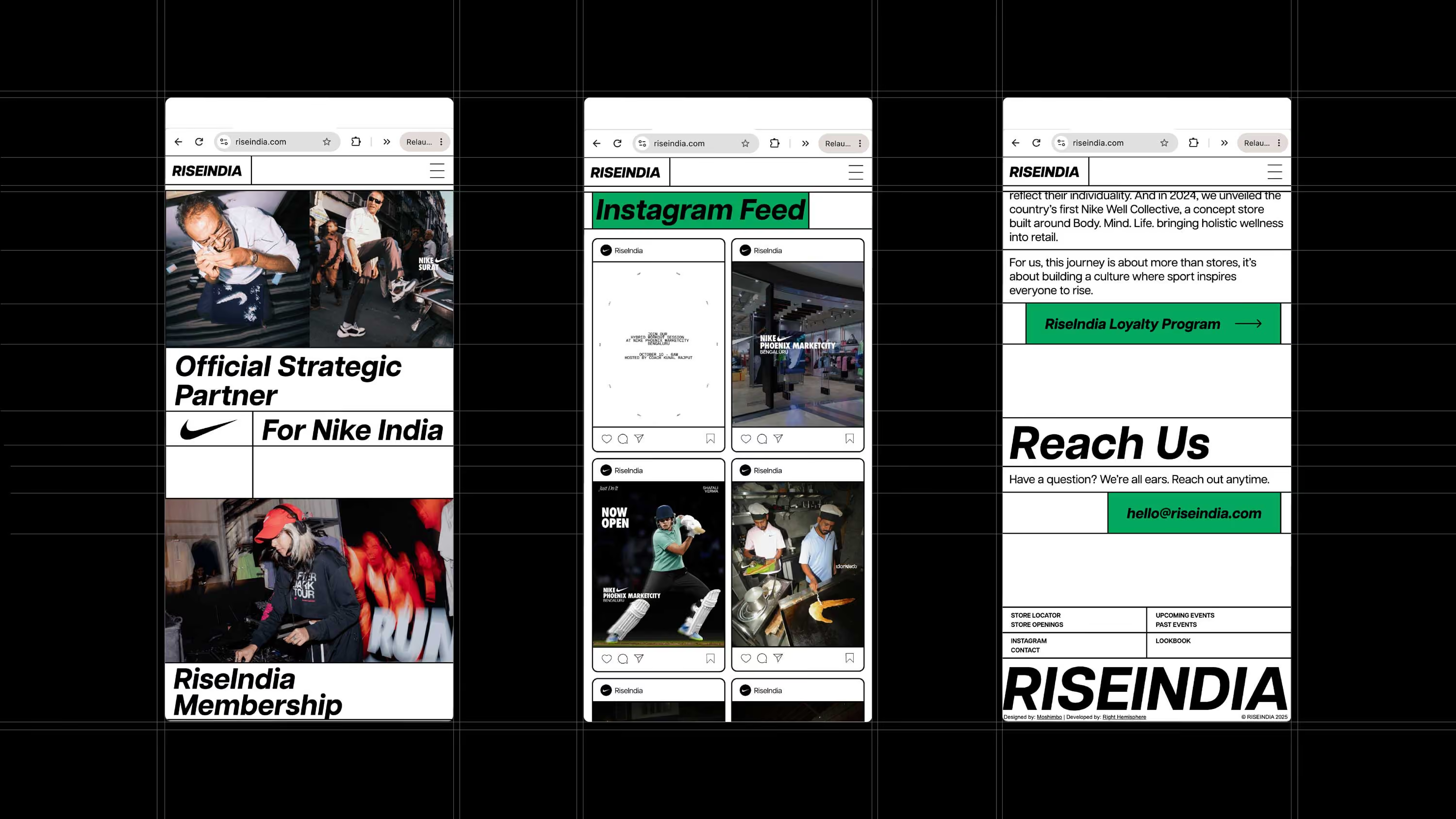
Athletes move in every direction. So why should a website stick to the usual top-to-bottom routine? We played with movement across the screen, creating a more dynamic browsing experience that feels less like scrolling through a website and more like moving through a space.
A grid with a game plan.
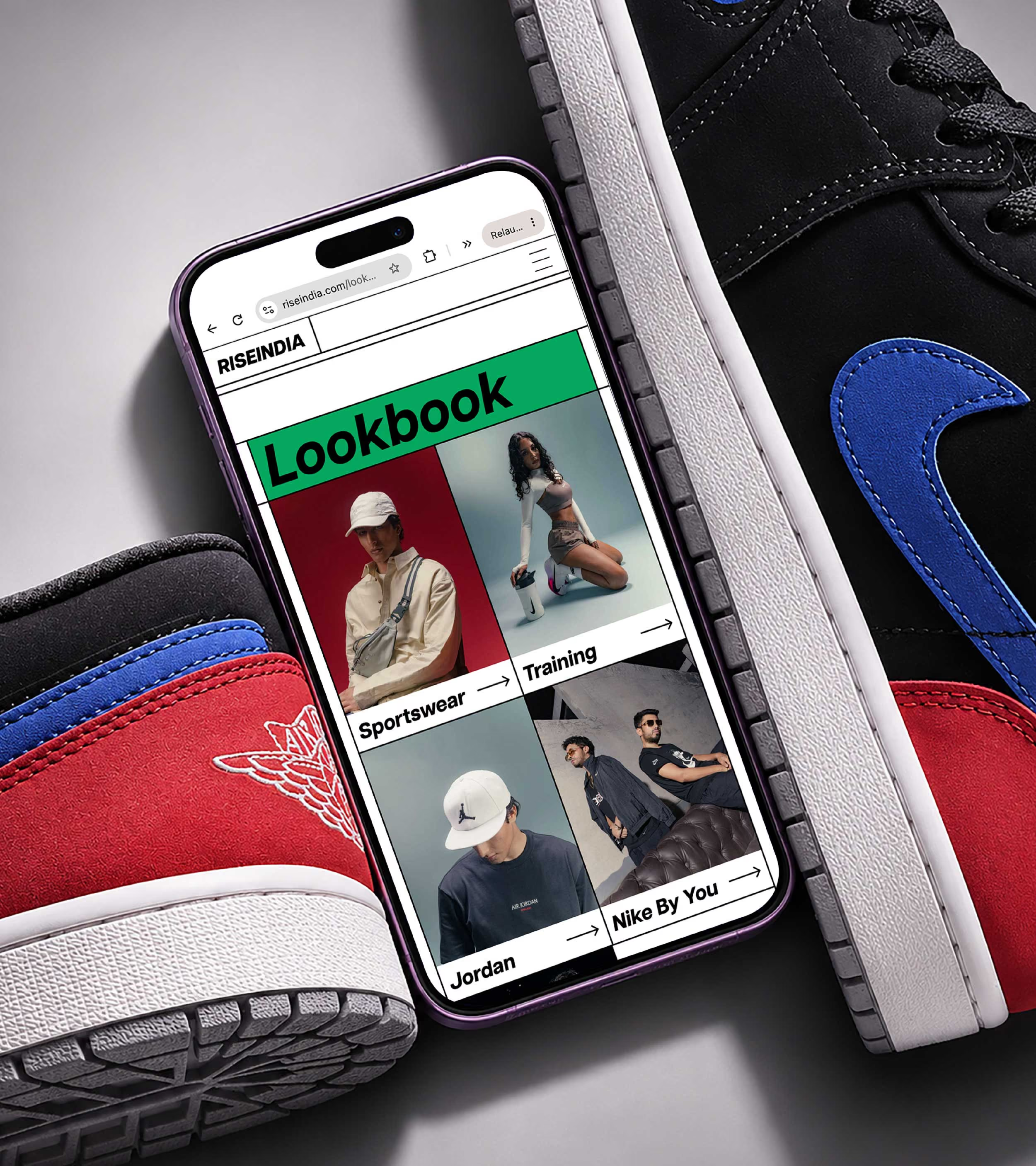
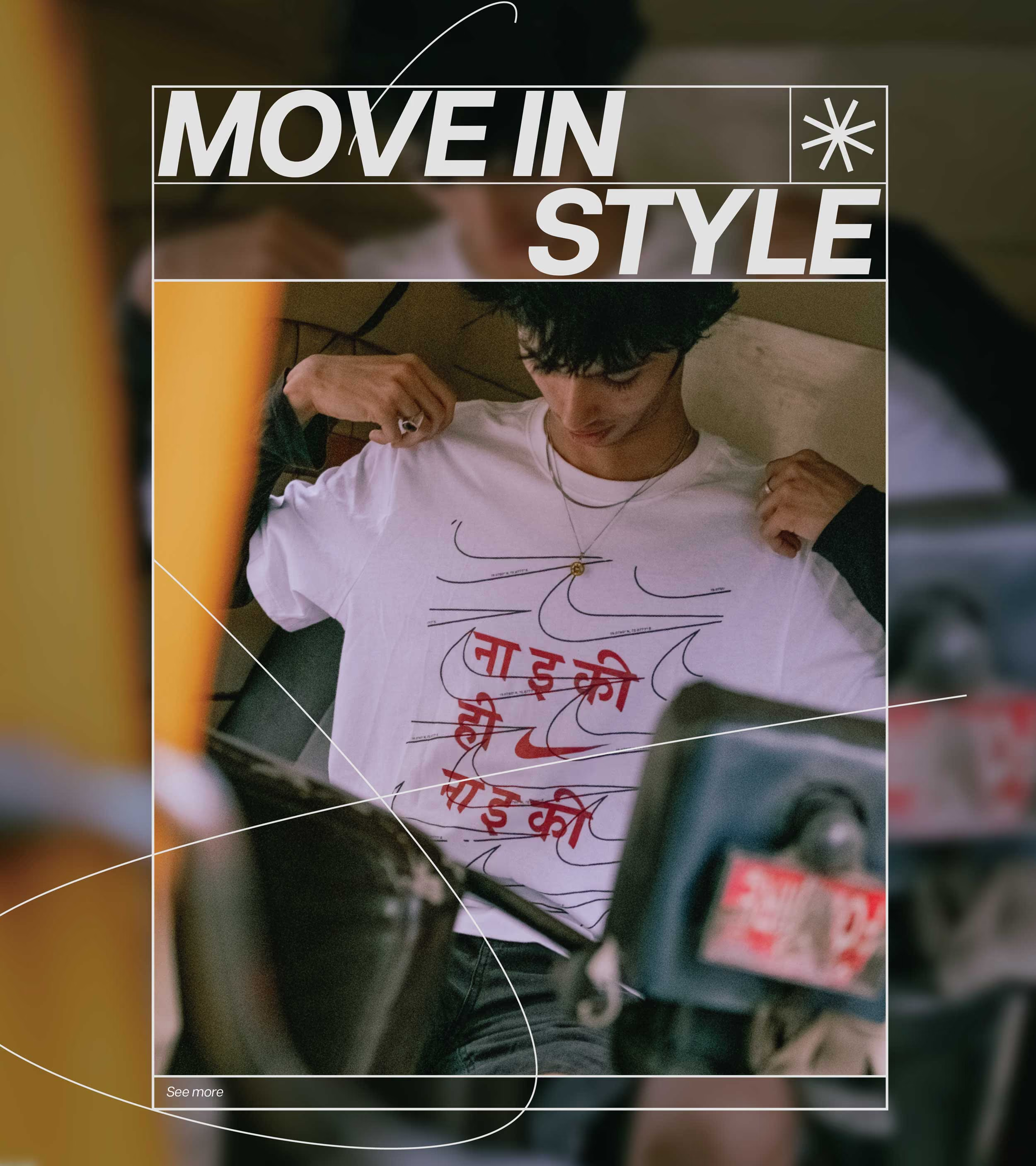
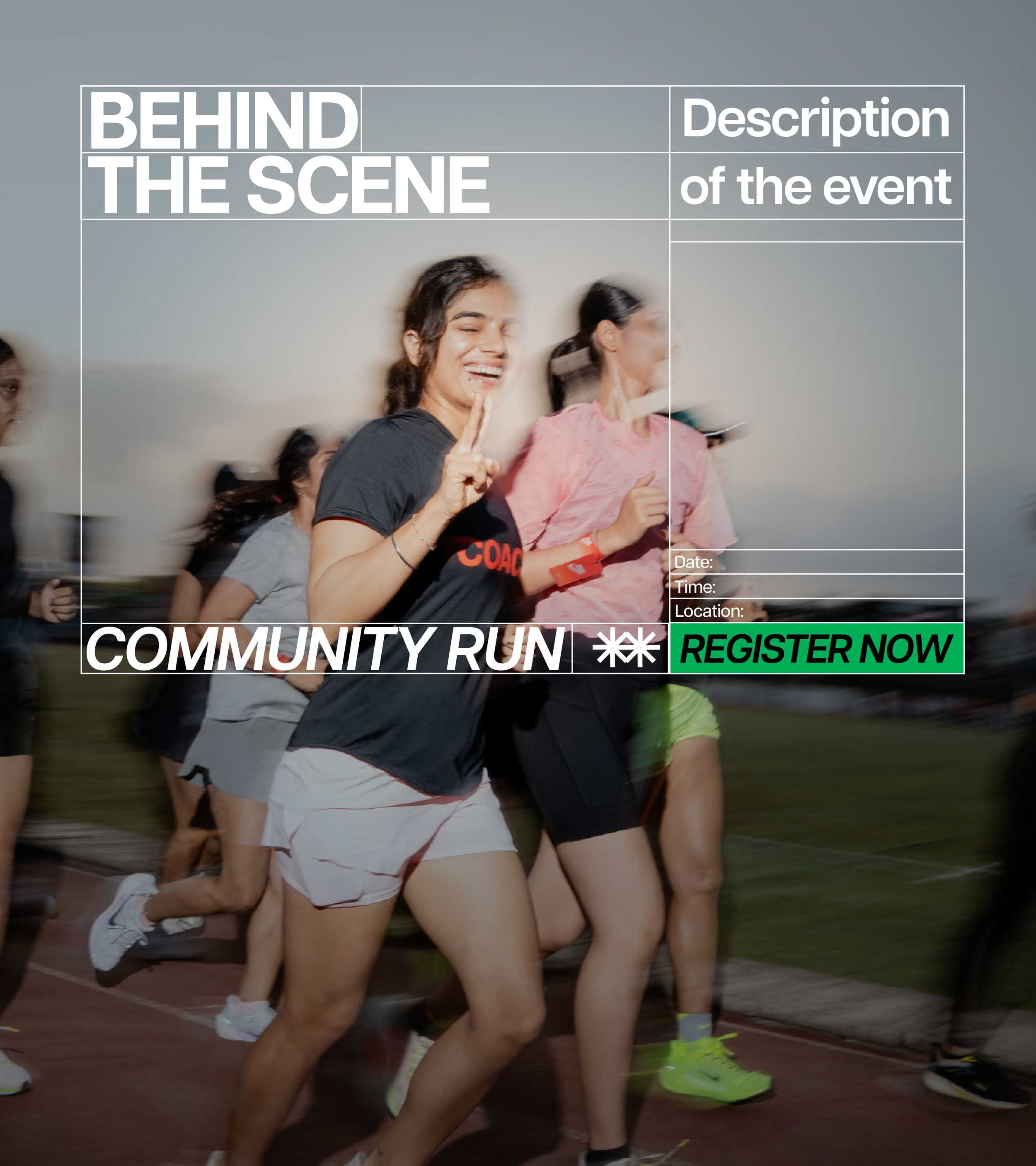
When you've got hundreds of incredible images to work with, you don't want the design getting in their way. We built a flexible grid system that gives the imagery room to flow, while keeping everything in order.
Same lines. Different moves.
The grid became our playing field. Content shifts, lines change direction, layouts open up and close in. Different sections take different forms, but everything follows the same underlying structure.
A bit like running your track, switching lanes and changing direction without losing your rhythm.The result is a digital experience that takes an already established brand language and gives it a new way to move.
A bit like running your track, switching lanes and changing direction without losing your rhythm.The result is a digital experience that takes an already established brand language and gives it a new way to move.


go back
Giving India's sporting community a new digital playground.
play
pause