Van

Creating spaces that tell stories
Design Strategy
 • Brand Identity • Design
Visual Guide
 •  Website Design
VAN is not your typical architecture studio—not in any sense. Unlike most, they don’t just create picture-perfect homes; they build spaces that are personal, efficient, and full of character. Every project is a one-of-one, shaped by the lives and stories of the people who will call it home. When VAN approached us, they were ready to turn that belief into a brand—one that could carry the emotion and individuality of their work.
Van, the vehicle vs Van, the philosophy
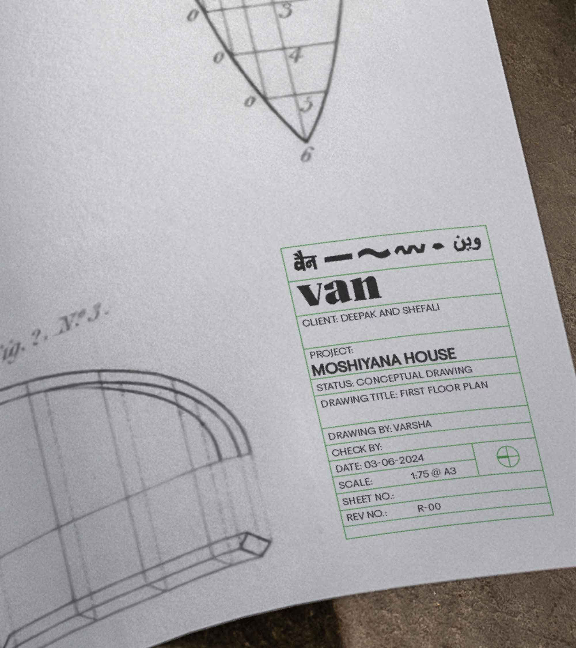
VAN tells stories through spaces, and every story needs a title. To bring this idea to life, we turned to a form of storytelling that is bold, expressive, and deeply rooted in Indian culture: the classic Bollywood poster. This style became the perfect metaphor for the kind of homes VAN builds—vivid, memorable, full of soul. The new identity became a title card—of the stories they have built.The inclusion of Hindi and Urdu went beyond aesthetics—it echoed the layered thinking, diverse voices, and shared cultures that come together to make a house feel like home.Also, VAN is more than just a name. It’s a philosophy. Like the vehicle it’s named after, VAN is flexible, adaptable, and always in motion—shaped by the people it serves. The skid mark, a subtle graphic drawn from the trail a van leaves behind, became a symbol of the journey and the imprint each project makes.
A brand that moves like its name
We created a simple design system that could travel as far and wide as VAN’s vision. A custom typeface brought structure and distinctness, while the website gave the brand a home as fluid and layered as its work. Like the studio itself, the identity is rooted in design but never stuck in place—ready to adapt, evolve, and tell the next story.
Building a visual world for the stories of storytellers.
play
pause